


Intro
As I was making my game Dwell, I realized that my lack of art skills was going to hold me back from making the games to the quality I wanted. I was relying on AI assets that I hand-edited, but it wasn’t going to be enough: AI just isn’t that good or consistent.
So, like all of my problems: I decided to solve it the hard way and learn how to art.
Using a copy of Aseprite I’ve had for a while, I’ve started drawing pixel art, starting with a 16x16 canvas, practicing various techniques, and hopefully working my way up to 128x128 (and beyond)!
I also picked up a book, Art Fundamentals, on recommendation from a friend.
This page contains some of the drawings I’ve made as I’m learning- like a learning log! I’m looking forward to looking back one day and seeing how far I can get.
September 2026

I decided to start with random doodles and sketches - each row above is a day of doodles from the initial three days, starting 09/25/2026.
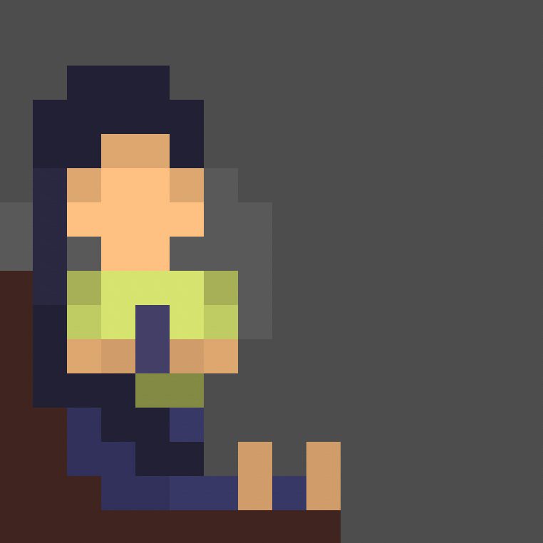
I just wanted to draw my wife reading her e-book - she’s kind of a book monster! Practicing lighting up her face with the glow of her phone was an interesting exercise and made me appreciate shading a lot more than just shading a flat circle.
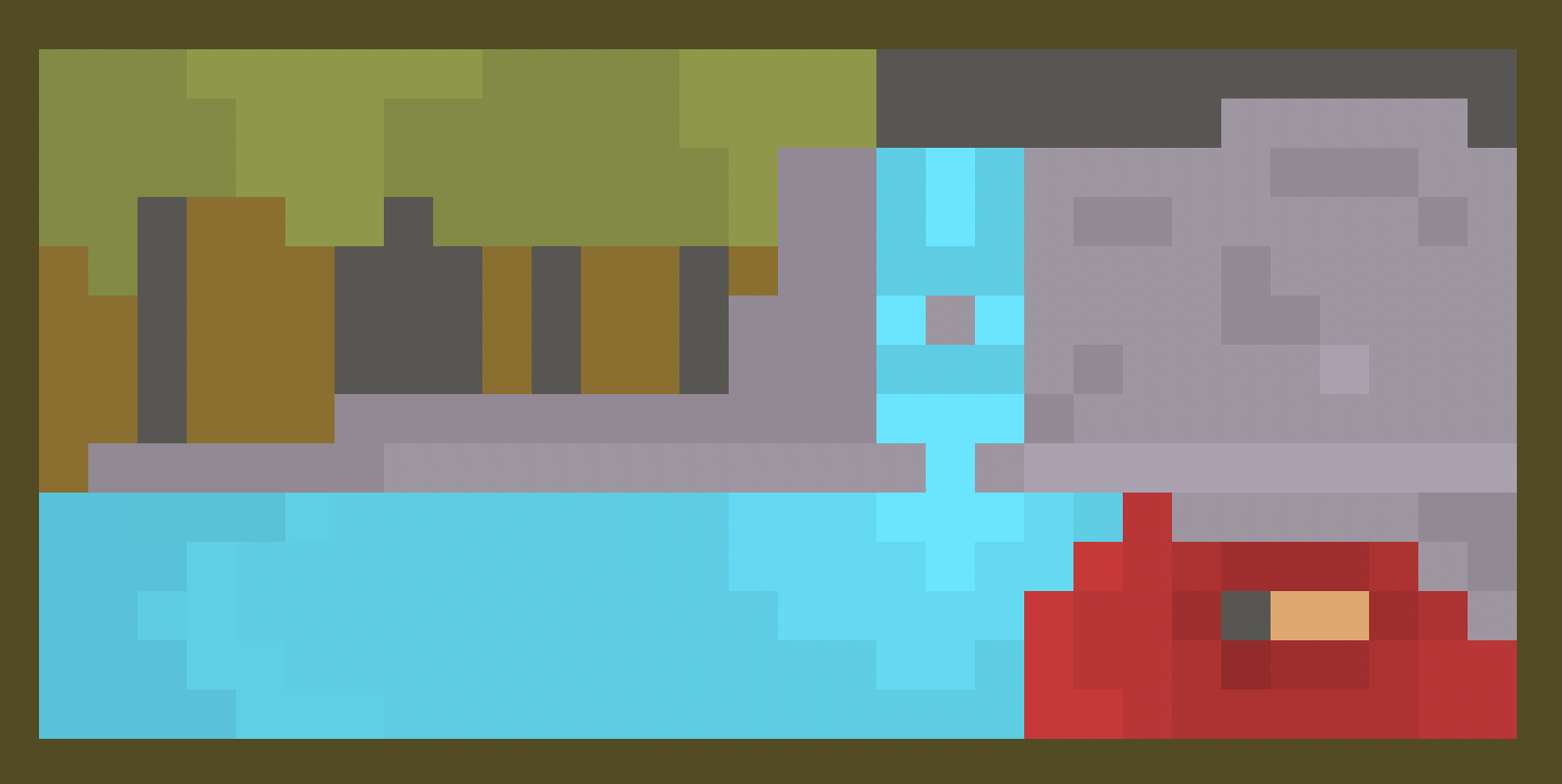
I sometimes find it hard to turn my brain off and enjoy the present. I often calculate what might go wrong and plan for worst-case scenarios. Cold Swim takes one of my happy places, a forest lake, and illustrates one possible outcome - a brief moment of anxiety come to life.
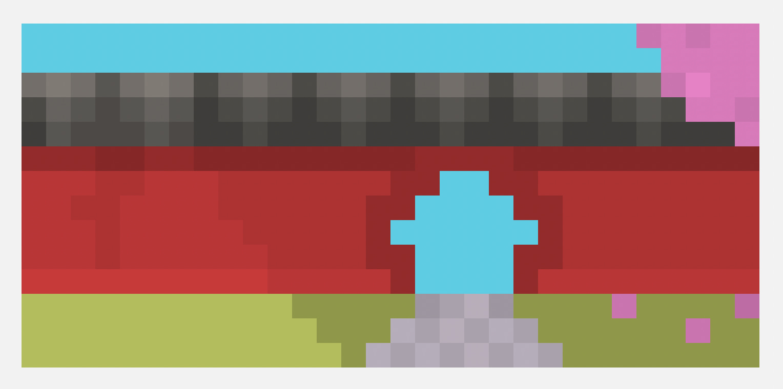
When there’s an entry, the natural reaction is - what’s beyond it? What mysteries lie on the other side?
Then I thought to myself: entries work both ways. What’s the mystery on this side?
I used Beyond the Gate to explore the idea while practicing lighting.
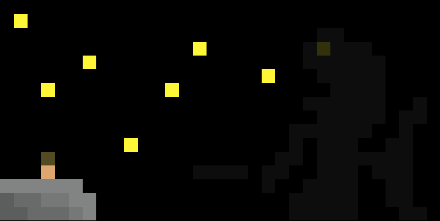
I’ve always been a fan of art with hidden, enormous, incomprehensible monsters that aren’t immediately obvious. For Star-Eater, I wanted to evoke a sense of awe while practicing achieving a sense of scale in a composition.
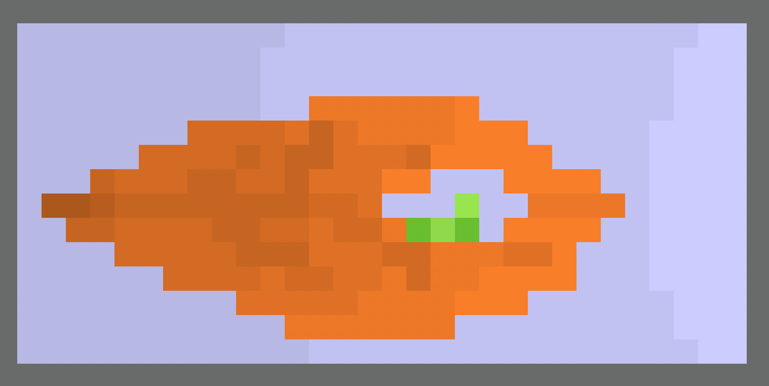
Bite started as a practice objects I was drawing. I had drawn a leaf, found it boring, and then decided to add by subtracting: I punched a bite-sized hole into it. I then added the caterpillar because it felt cute and the whole scene started feeling a bit melancholy - a leaf and lonely caterpillar drifting through the air.
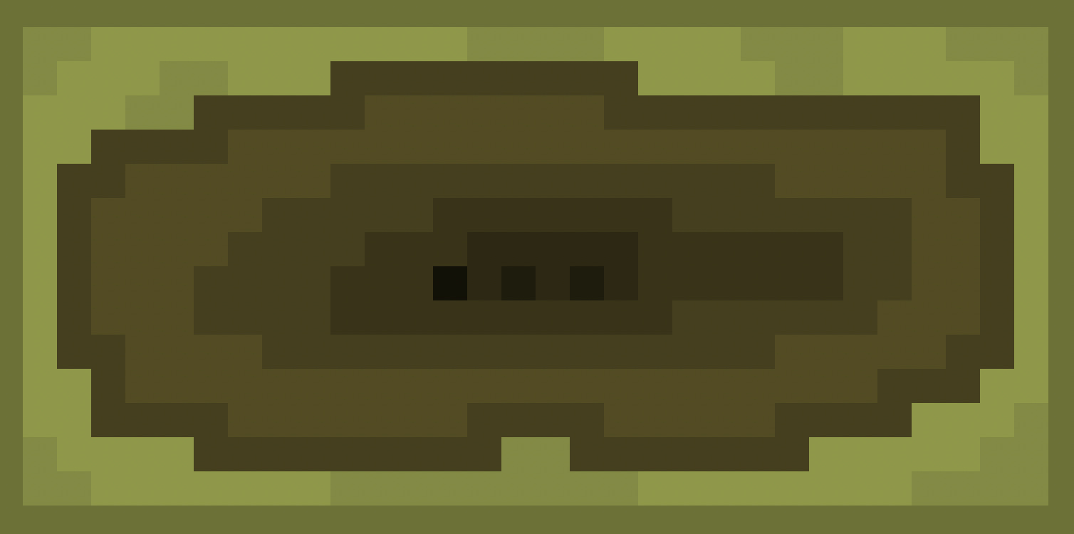
Peek is a reminder that if you can see it, it can see you.
I was practicing trying to achieve a sense of depth and decided there was no better way than to draw a hole. Once I got to the bottom, I stared at it for a while and remembered that sightlines work both ways.
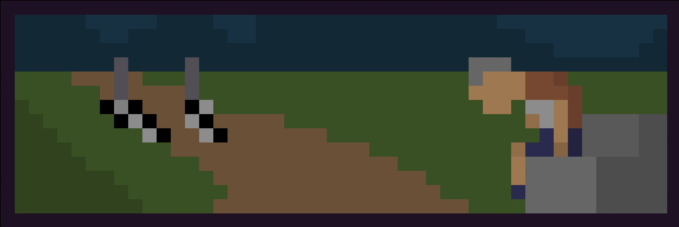
I used Last Place to explore manipulating proportions to provide a sense of distance. By the time I realized I had accidentally used a 48x16px canvas, I was already done.
My initial attempt had the podium in the distance but that suggested the person hadn’t finished the race yet.
Moving the podium let him finish the race - but what then?
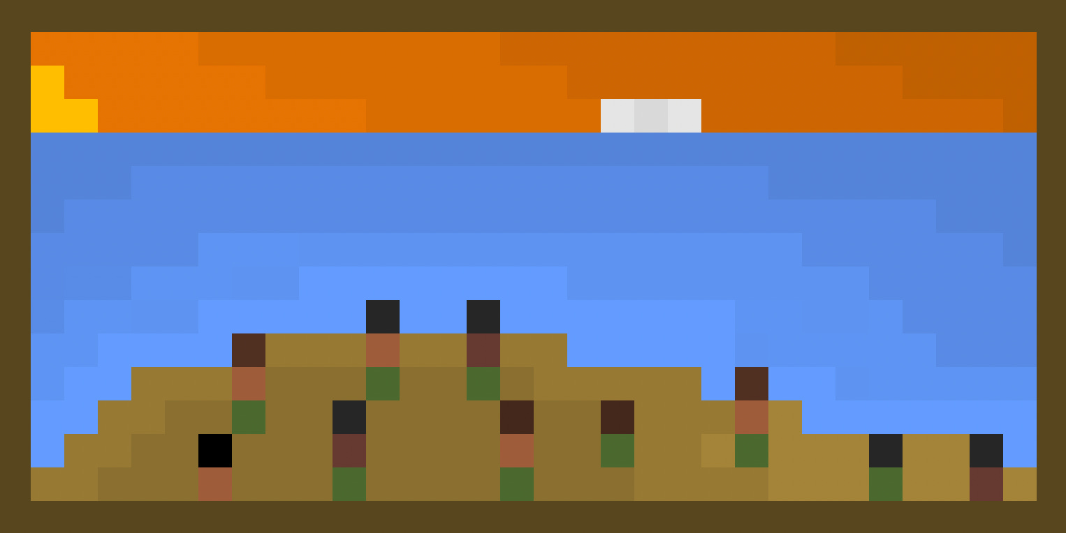
The word aloha can be used as both a greeting and a farewell.
I made Aloha? to explore the ambiguity. Is the sun setting or rising? What is that in the distance? Is it coming or going? Is it friendly or not?
Learning art is a daunting task. I have concepts and ideas and what I want to achieve in my head, but lack the technical skill to get there.
I rely on the knowledge of others - through writing and videos - but there’s so much ahead, it’s almost blinding.
Guidance can point the way, but it doesn’t guarantee you’ll reach your destination.
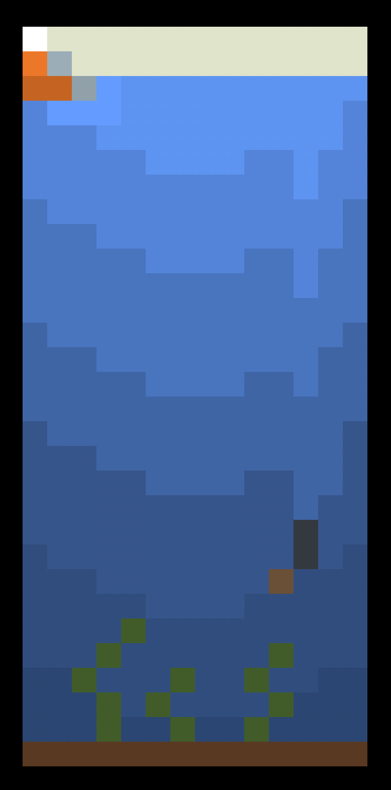
Learning art has been fun. It’s daunting, and there’s so much to learn, but the end result of one day being able to express my thoughts and ideas with visual clarity is very motivating.
It still feels like drowning, though.
October 2026
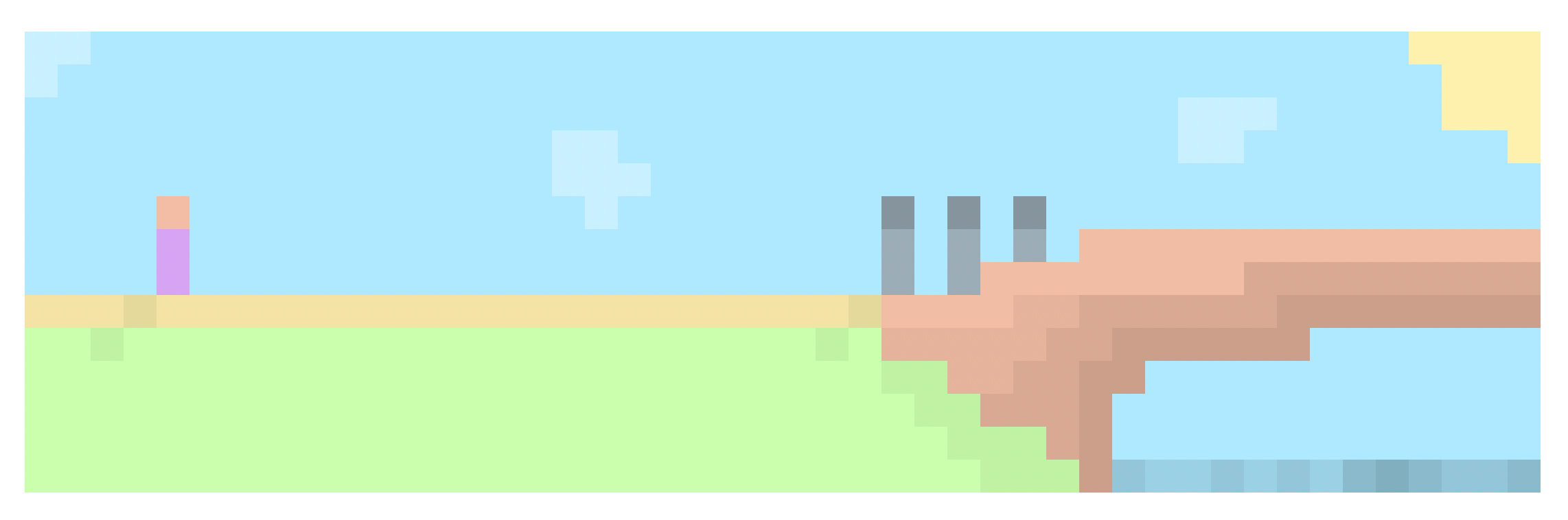
As I practice composition, I’m learning that even small differences in position have a large impact. Moving the person just a few pixels left or right greatly changes the level of tension and ambiguity in the scene.
Across started as a picnic scene to work with pastels, and quickly became an exercise in proxemics. It’s a reminder that you often can’t tell how a situation will evolve with the information you start with.
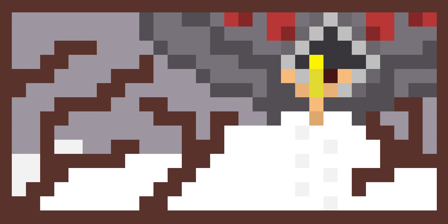
Putting things you create out into the world is a bit scary. Even the things you think turned out pretty OK - you don’t know what you don’t know, and I know just a few days into this that my technique and execution has a lot of flaws.
I know mentally and practically very few, if any people, will actually see any of this, but the nerve is still there. Even with framing, people will always pass their own judgements.
Luckily, software engineering has a culture of putting it out there, so it’s not a blocker.
So, I’ll submit anyways.
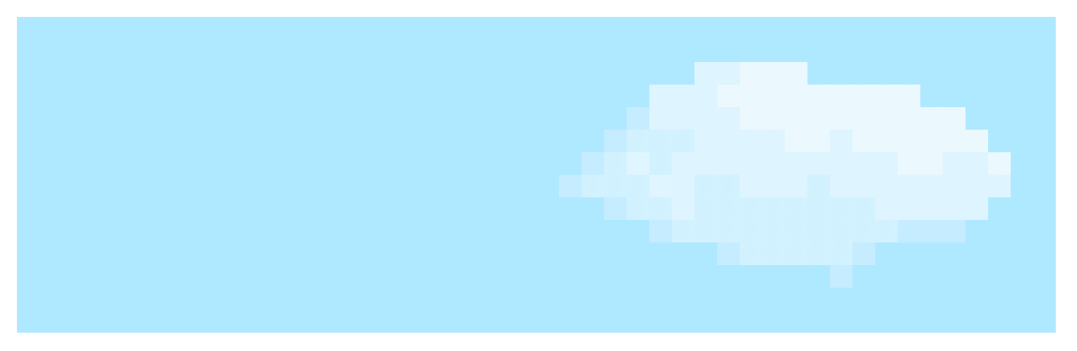
Playing around with Saturation, not Value, and being cognizant of light source lets me make things that look billowing and fluffy.
There’s so many things I can visualize with this new understanding.
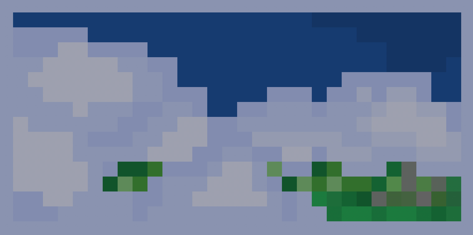
The clouds didn’t come out how I wanted - I wanted to get a fog-like effect. I also made they way too chunky and I don’t really have any idea of where my light is coming from here.
The clouds obscure the jungle. As I get better technically, maybe I’ll be able to see more of the canopy.
A bigger canvas affords me more space for details, which is nice, but the larger surface area means further distance from ‘done’.
I found myself getting impatient, copy-pasting once I had a pattern instead of drawing it pixel by pixel. Is that cheating? Does it still count as ‘art’ or ‘drawing’ if you don’t place every brush-stroke, every pixel?
I think my impatience comes from my lack of skill. I see what I want to create. It just doesn’t come out the way I envision it.
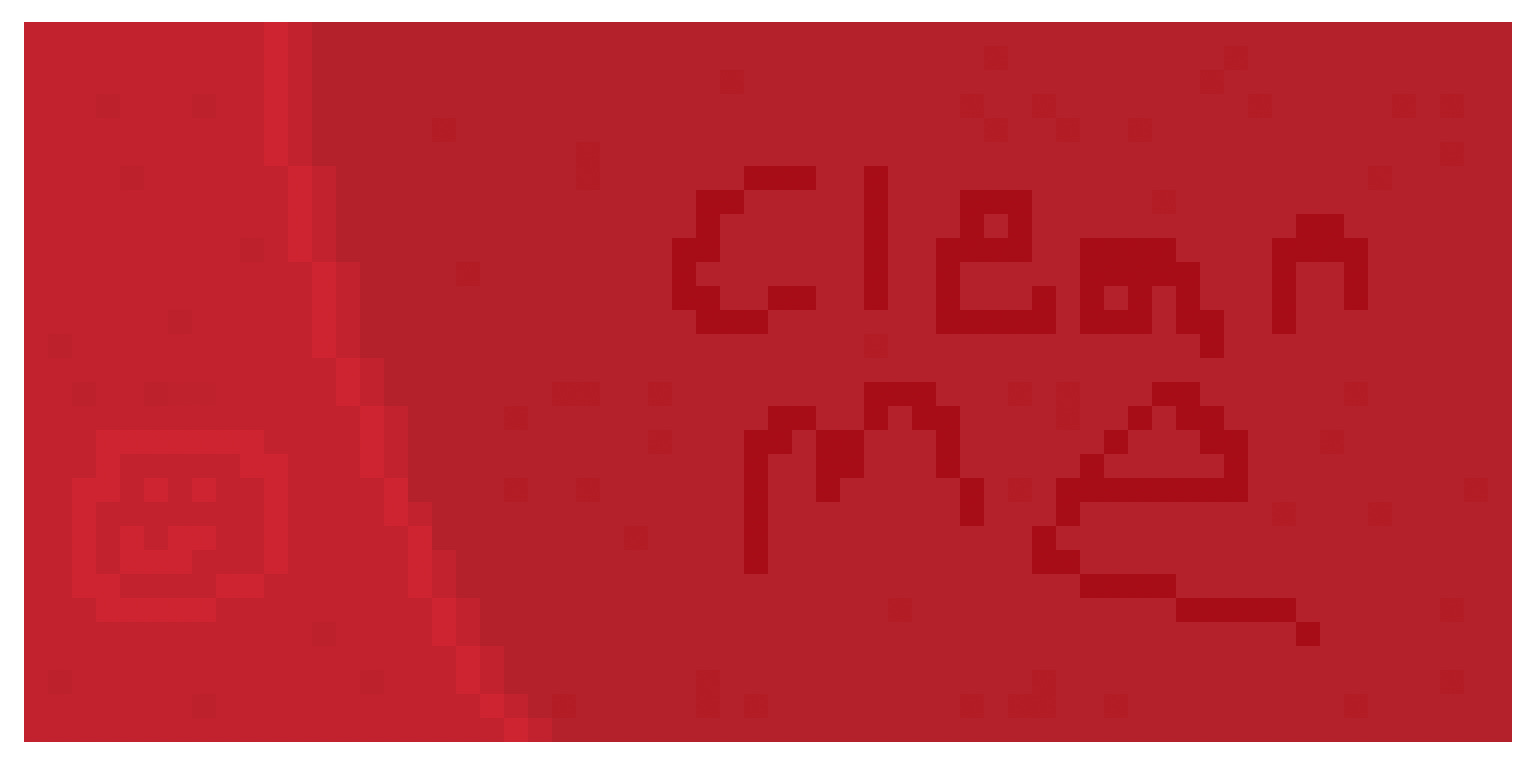
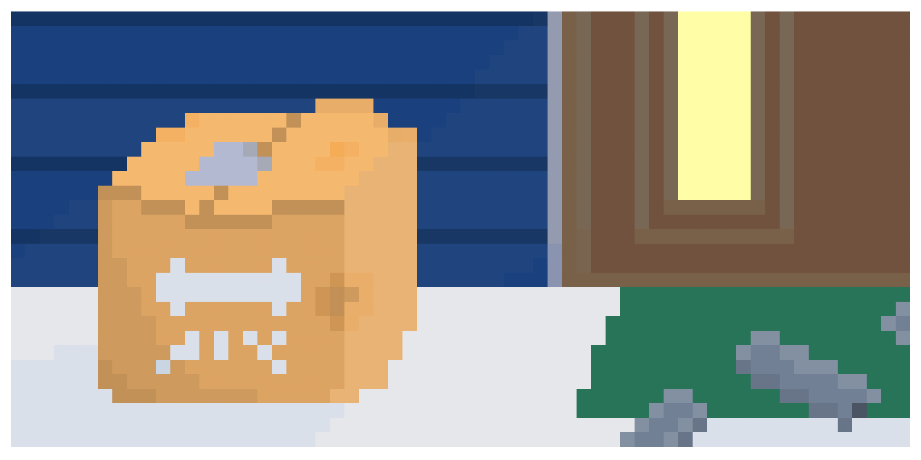
My wife's car, a bright red Subaru, often goes weeks without a bath, building up a cakey dust from miles of highway driving.
As I was practicing color coordination and drawing what was initially a curtain, I thought the combination of reds I picked looked a lot like the dust on her car, so I drew this instead.
Even a bit of dust can provide a great canvas.
Perspective is hard.
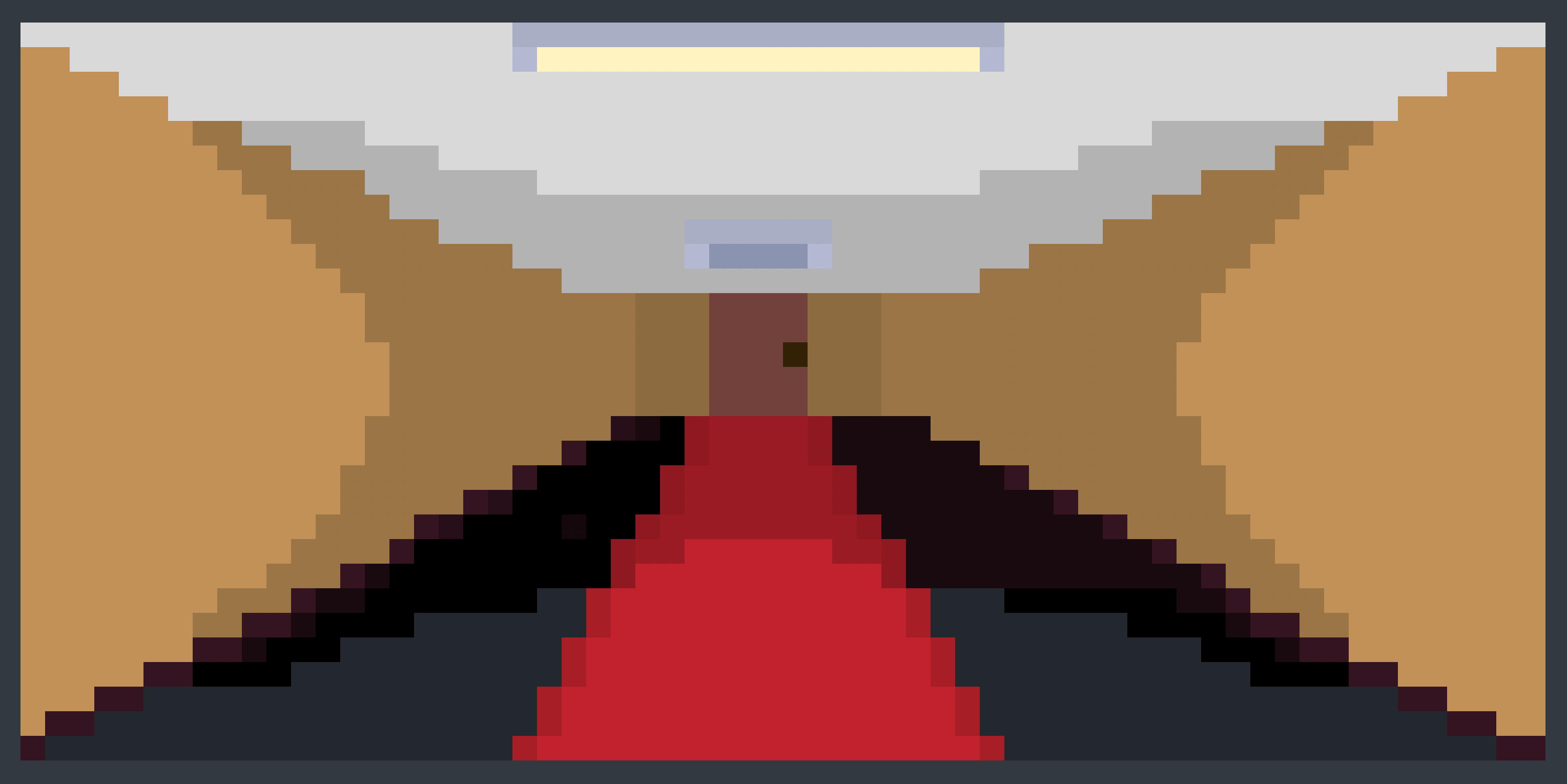
I was originally drawing a grocery store aisle and I didn’t have enough pixels to do a deep depth without things collapsing in immediately on the vanishing point. So, I switched things up and decided to attempt to draw a box with parallel edges, shadows, and colored shading to imply depth.
I almost abandoned the exercise completely, but hanged in there. I think the box came out OK for what it is, but the door still seems very flat.
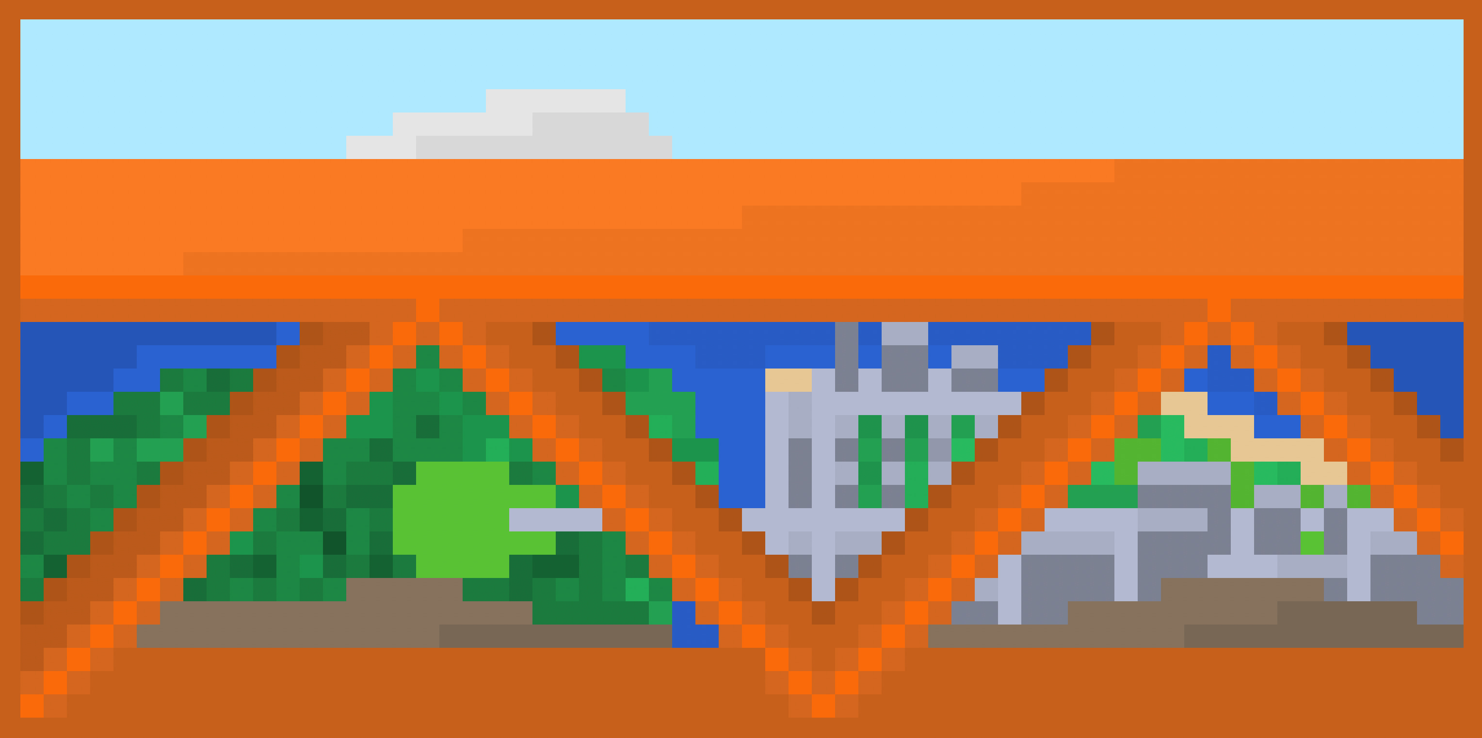
I get why people like art now. It’s an act of pure creation, limited only by your technical skills and imagination. Nobody is telling me what to draw, or why to draw it. I just do it because I feel like it.
I used to think drawing was boring - it’s why I never made it past random doodles in the past. But now I think it’s another way to tell stories, and narratives - to impart ideas and feelings and communicate.
It’s a shame it took me decades to realize that it’s a way to build worlds.
An end is always there, whether I perceive it or not.
I might be far from it. It might take great effort to get there. I might reach it suddenly or gradually. But there is an end.
Whether what comes before is good, bad, fulfilling, or shallow - the end itself doesn’t determine that.
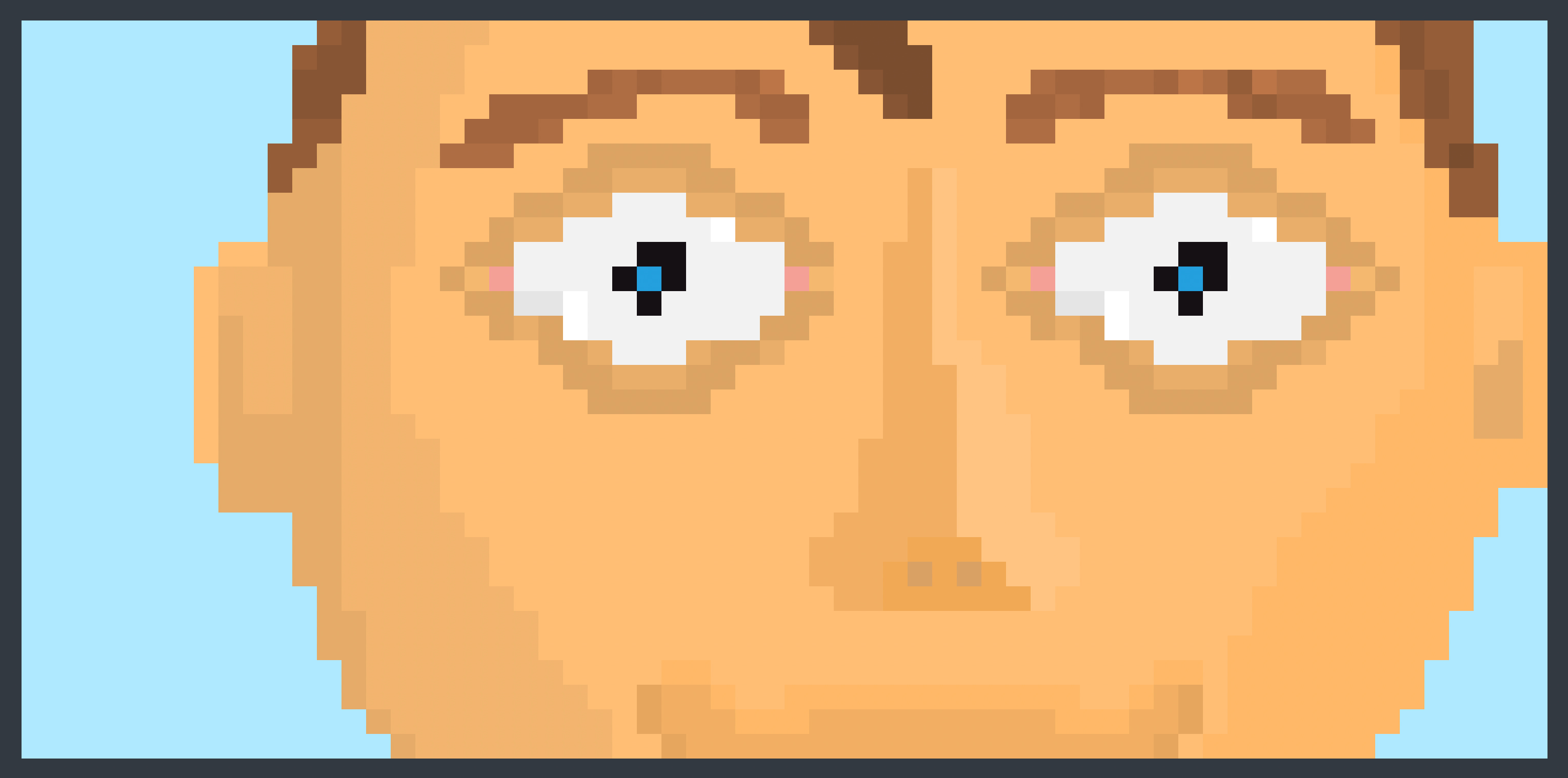
The next chapter in the Art Fundamentals book is Anatomy. I figured I should take a stab at it before I read it so I can understand what I'm doing wrong with mistakes under my belt.
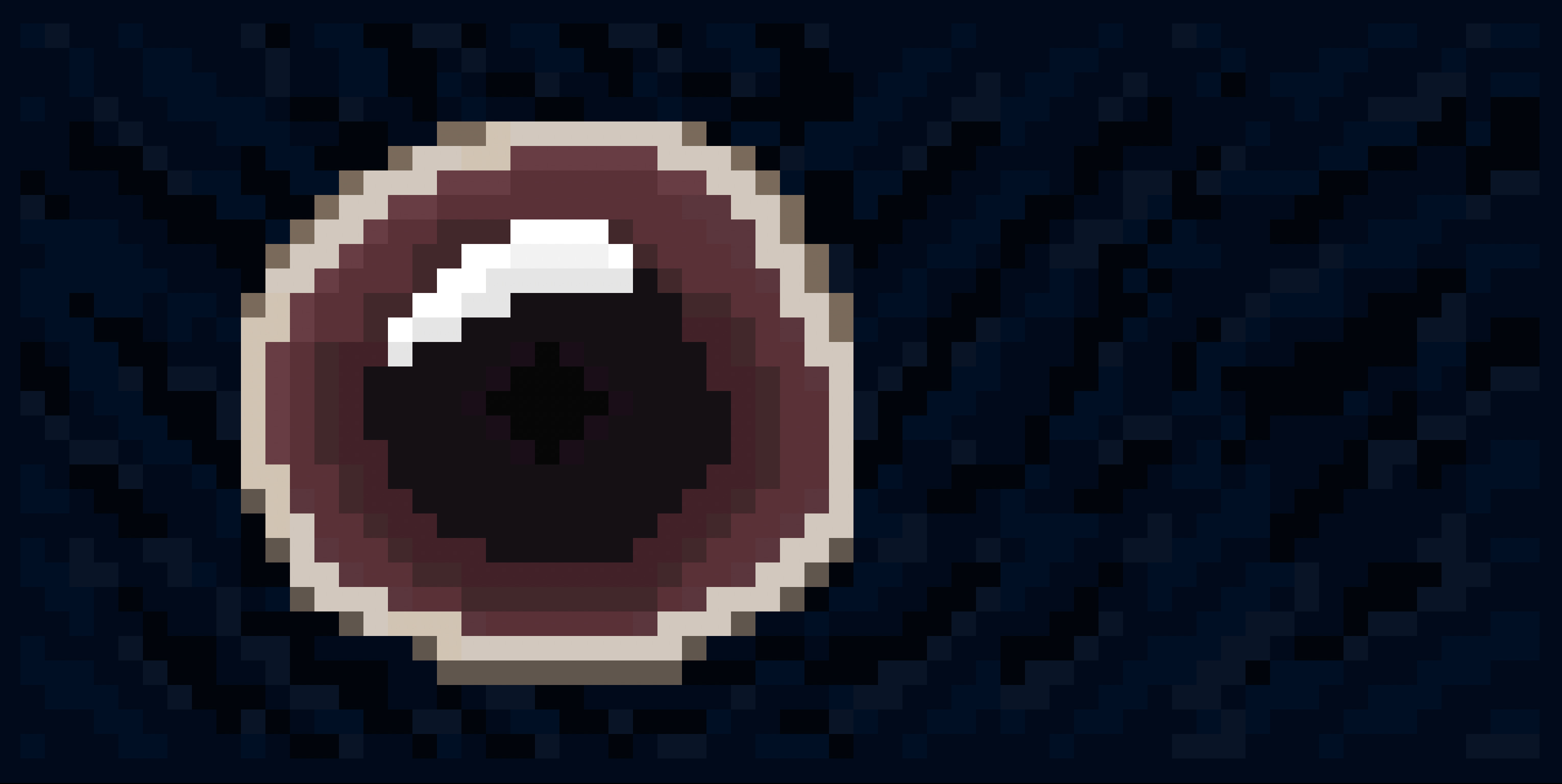
I intended on making a happy face but I lack skill - my result was nothing short of terrifying - I hope I never run into this person in an alley.
There's something about the eyes - it stares back - less Peek, more Gaze.
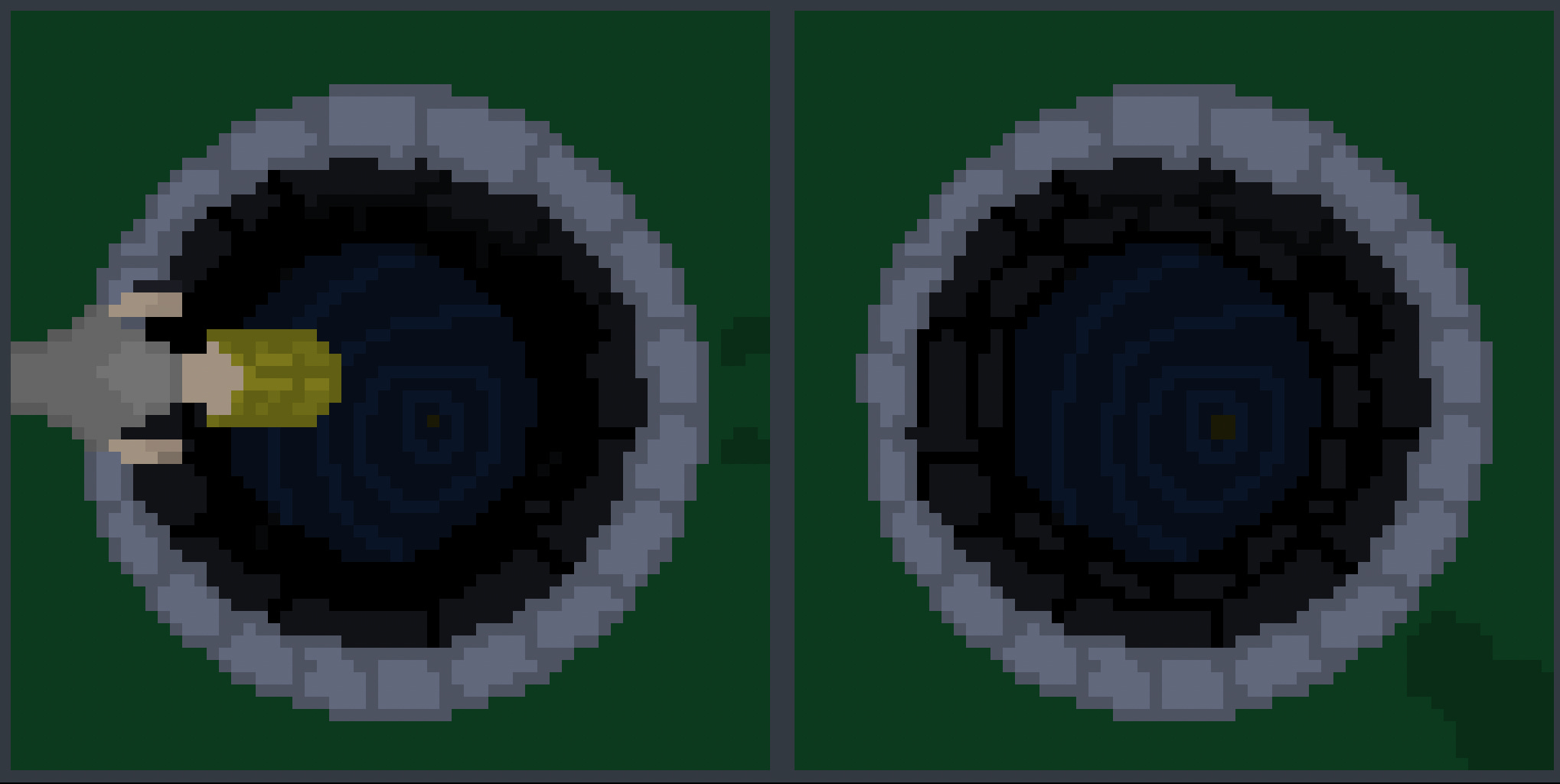
I wanted to draw a well, but I kind of lost the plot afterwards.
I tried two variants - one with a person and the other without. I think both have their merits, but neither really felt particularly interesting and I couldn’t figure out what I wanted to do with either.
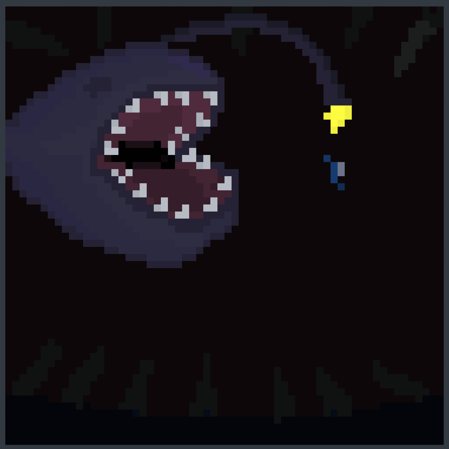
Compared to the first anglerfish I drew, this one ended up way better. It feels a bit more three-dimensional, though I didn’t pay much attention to the shading.
My next anglerfish will be quite a catch.
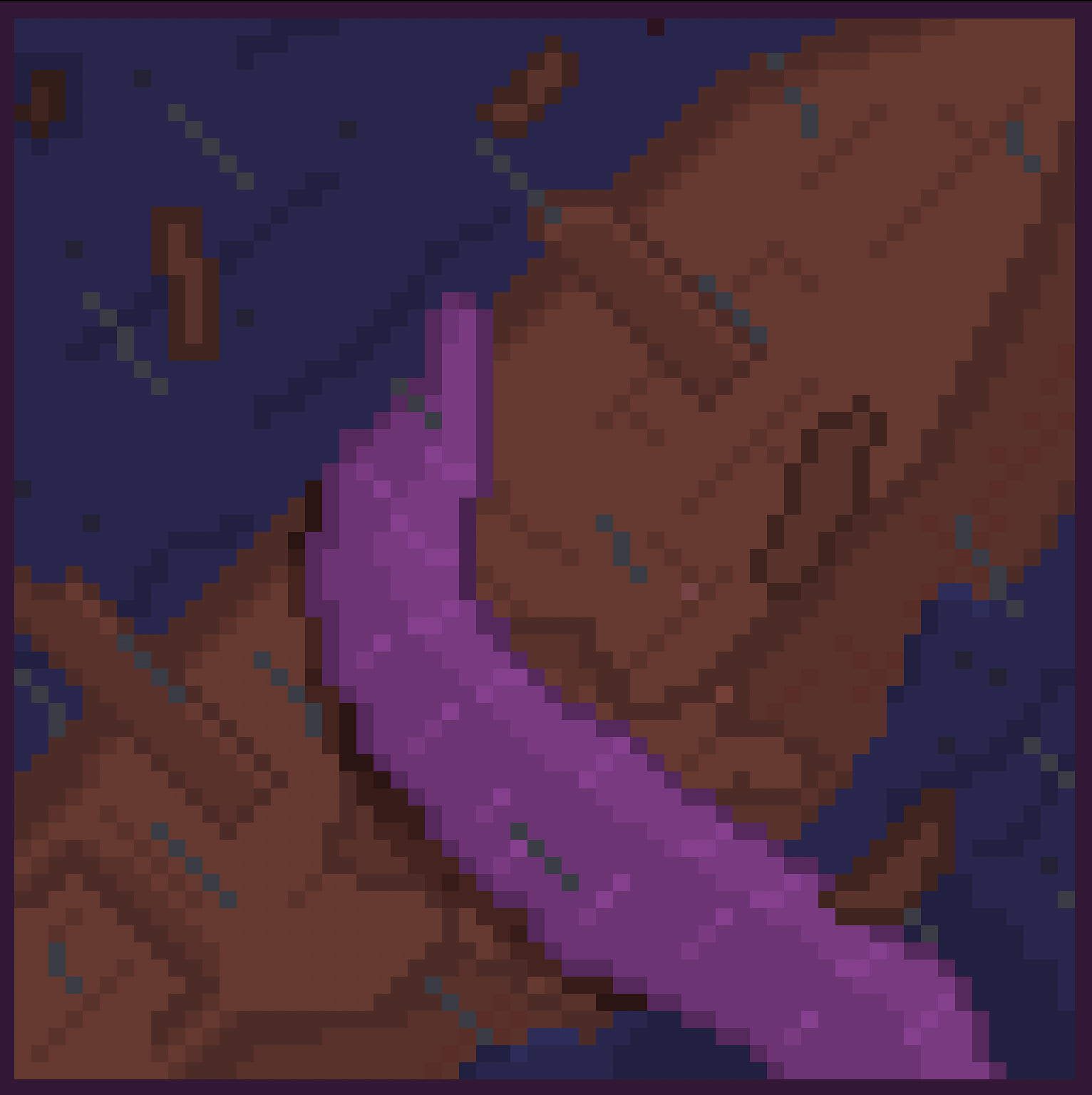
A 64x64 canvas size really affords me the ability to do more dimensional drawings. It takes me way longer, though. This is the first time I had to use layers to keep track of stuff.
I did discover that Aseprite supports blend modes like overlay and darken, so making shadows and other lighting effects is going to be way easier.
Though I still am making many mistakes - misaligned perspective, muddy depth indicators, missing shadows, sloppy line-work, I feel like I’m starting to get a grip on this and improving!
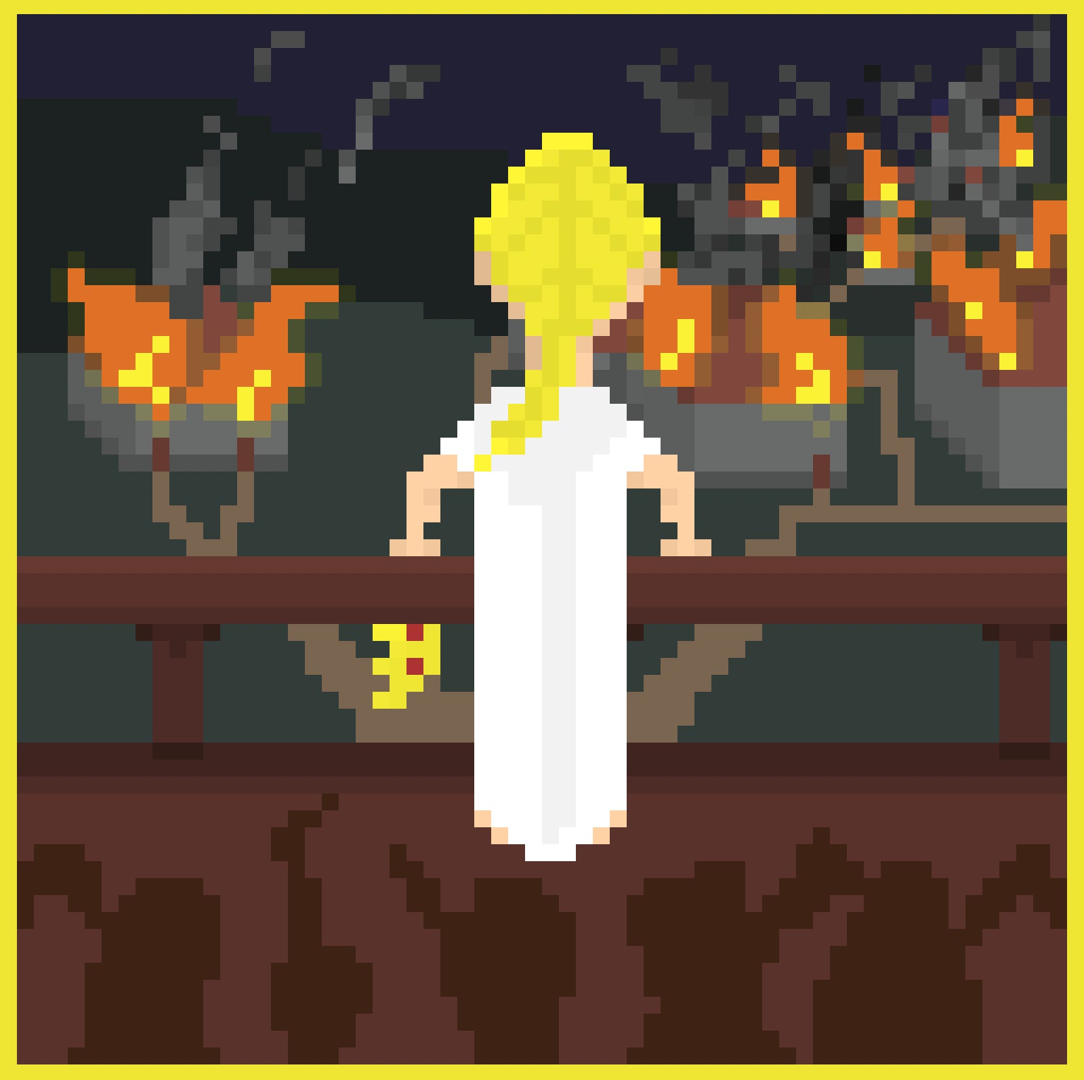
I wasn’t actually intending on drawing Next.
While I was clearing the canvas to start a new picture, I dragged the edge of Cracking across the screen to wipe it. It created a horizontal bar that looked like a railing and I thought to myself - ‘hm, that looks neat - what could that railing be used for’?
Sometimes you just don’t know what’s next.

I took a first stab at a usable game sprite: Eyebat.
The animation is a bit janky, but the level of granular control I now have is excellent. My prior AI-driven workflow would quickly degrade as I tried generating and animating assets. As I get better I’ll be able to make much more consistent sprites and animations and create things I actually want instead of AI approximations.
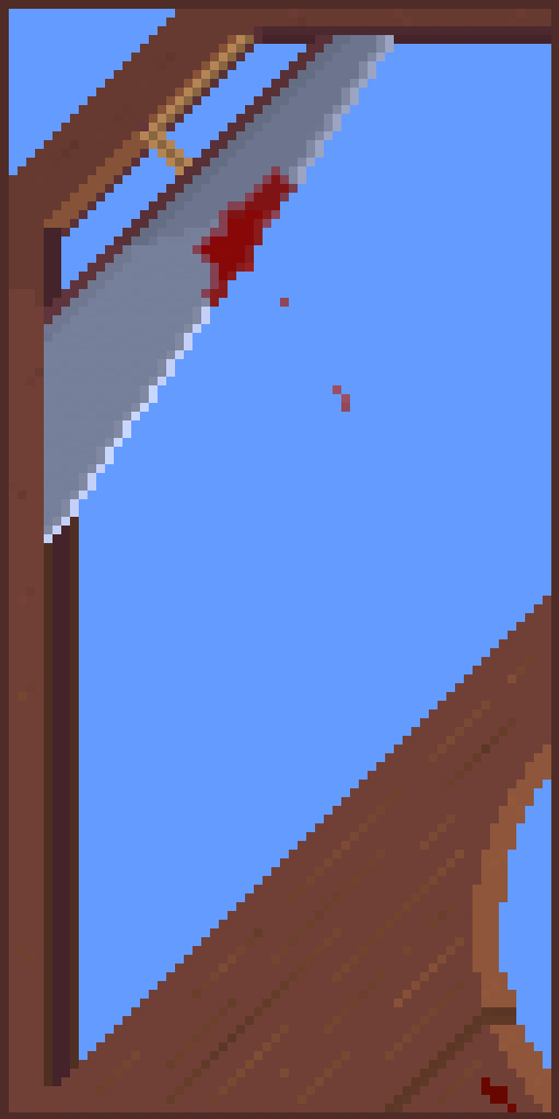
I originally was just making a close-up of a sword on a 64x64 canvas, but after it encompassed the screen at a harsh angle, I started feeling a sense of doom from the picture. I thought that was a good sign, so I expanded the canvas and turned it into a guillotine.
It took me a bit to get the blade right - I initially put it on the wrong way and had to redo all the shading, and I kept painting over the wrong layers - it’s easy to lose track.
I really like how this turned out - particularly the detail on the wood.
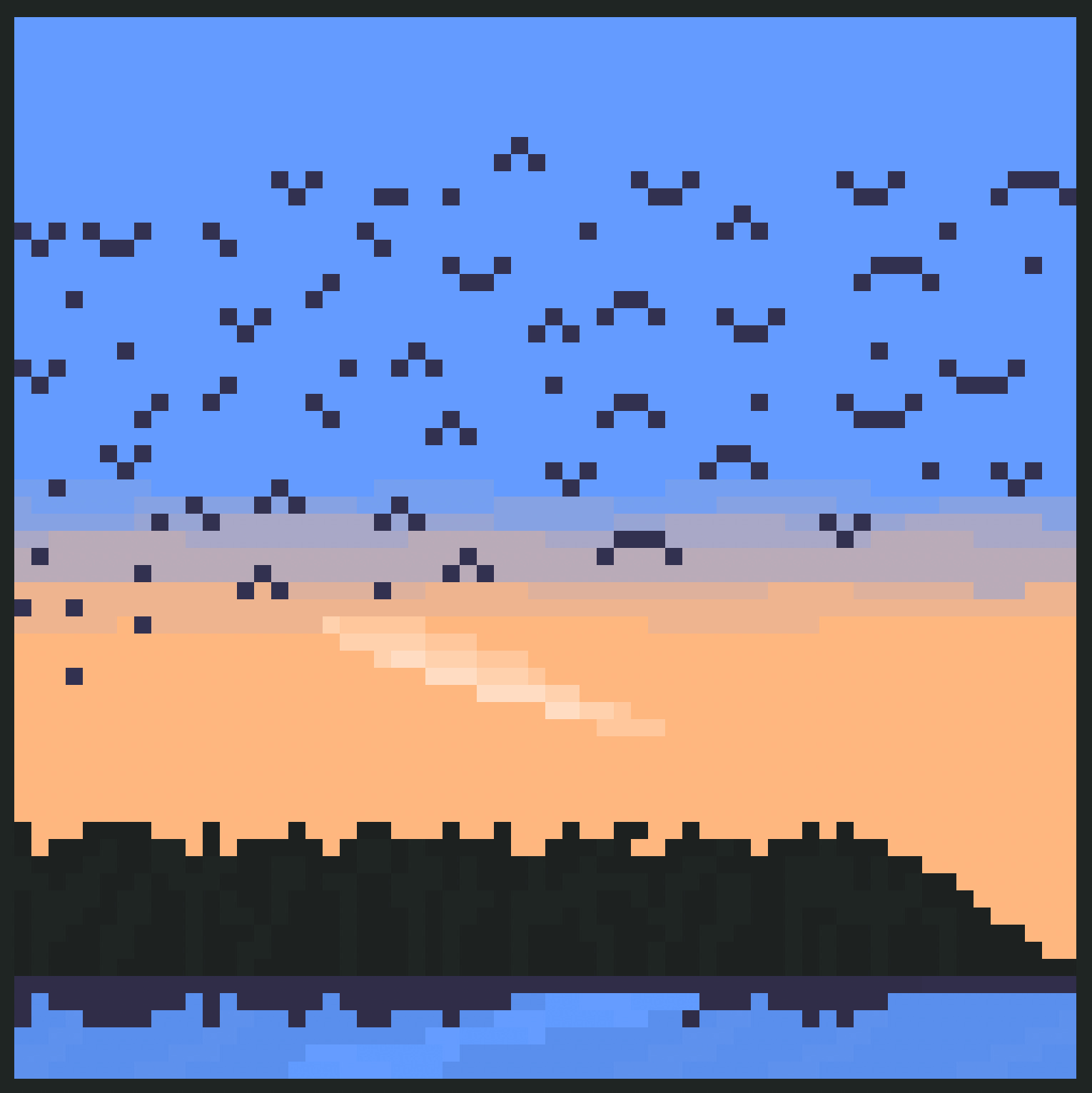
A flock of crows passed by overhead while I was at the park with my wife. We both watched as the crows flew by - it was serene and peaceful after a stressful day. After we got home, she painted the scene she saw with watercolors while I drew it with Aseprite - the first time we drew together.
Who knows where they’re going? I’m no bird-o-logist - not yet, anyways.
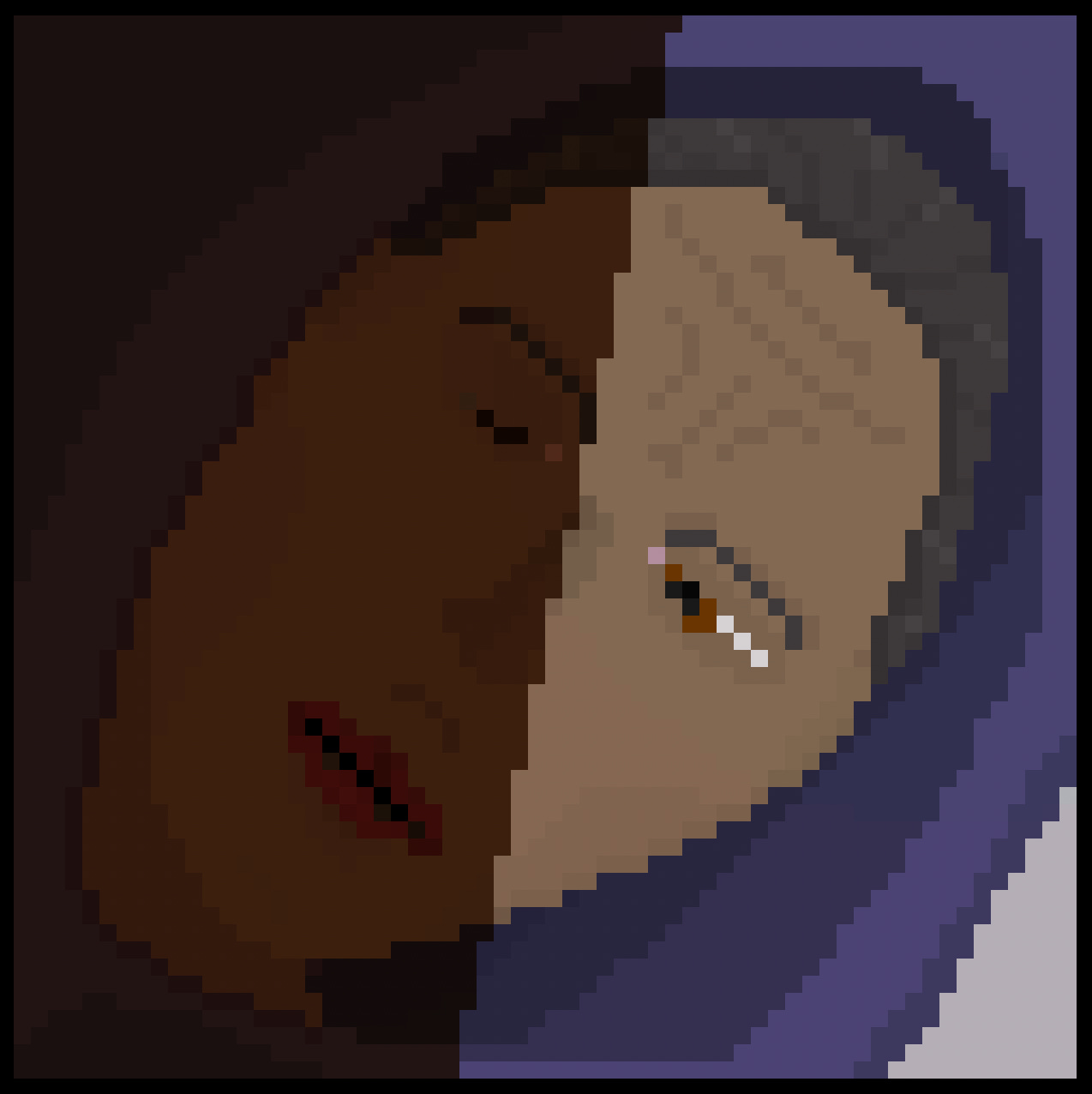
I started this after being interrupted in the early morning by a malfunctioning alarm and I couldn’t fall asleep. I wanted to capture the vibe of being interrupted.
Unfortunately - I just couldn’t draw it the way I wanted.
The lack of pixels on the 64x64 canvas just made it really hard to detail the awkward angle without it getting mushy or unreadable - specifically on the eyes - a single pixel throws off the proportion, and my desired angle of the face just wasn’t compatible. Because I couldn’t get the eyes to work, I didn’t bother trying to get the rest of the face to work.
As far as the rest of it goes - I think I did a decent job of the overall positioning and proportions - the face has the dimensions of a face.
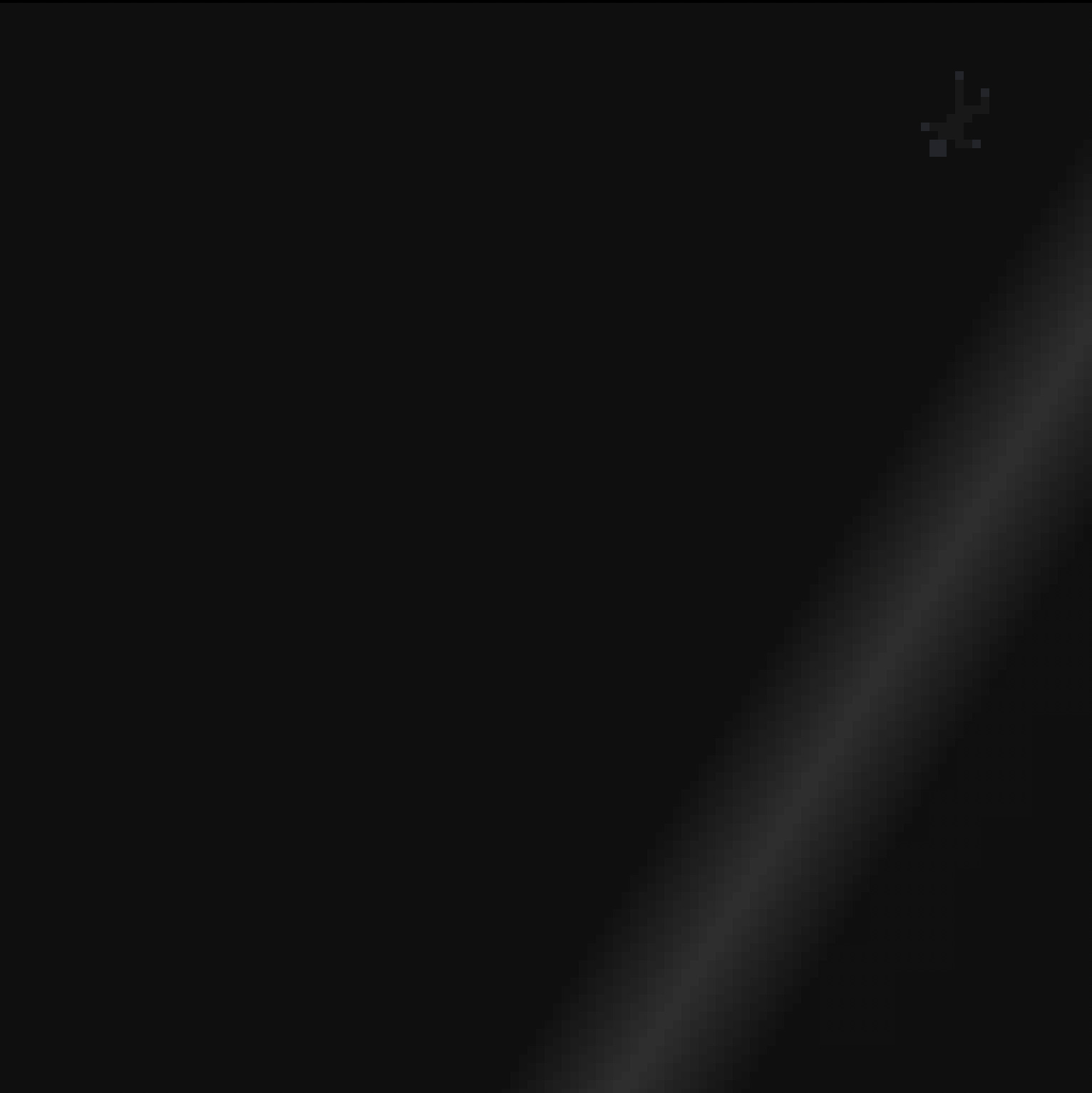
As I work on improving my drawing sklls, my ability to communicate is improving.
But, I’ve also discovered: not all ideas are worth exploring.
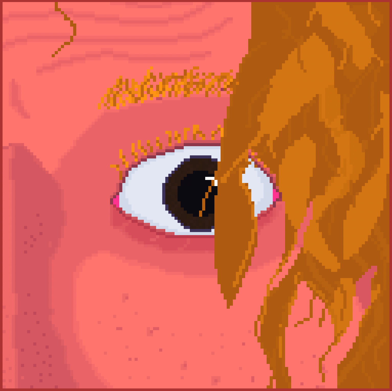
A 128x128 canvas definitely gives more space for things I couldn’t do as effectively on the smaller canvases - edge anti-aliasing w/ intermediate colors, more texture and details, and particularly curves.
Faces in particular seem to benefit a lot since a lot of the face seems to just be planes that you have to figure out how to visually separate and imply depth - a lot harder when you have 4px vs. 16px in any given spot.
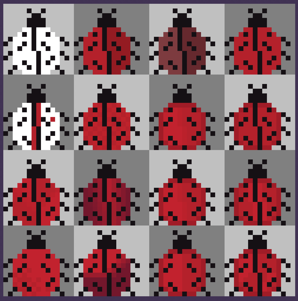
Something is weird with my shading. I can’t quite put my finger on it.'I need to isolate it, so I need to go back to basics.
What am I missing? The light source? The direction? The curvature of the surface? The hue? Tint? Value? Am I just sloppy with the placement? Is it the shading at all? Is it the pixels? Am I just not anti-aliasing when I can? Is it the clutter from the shell?
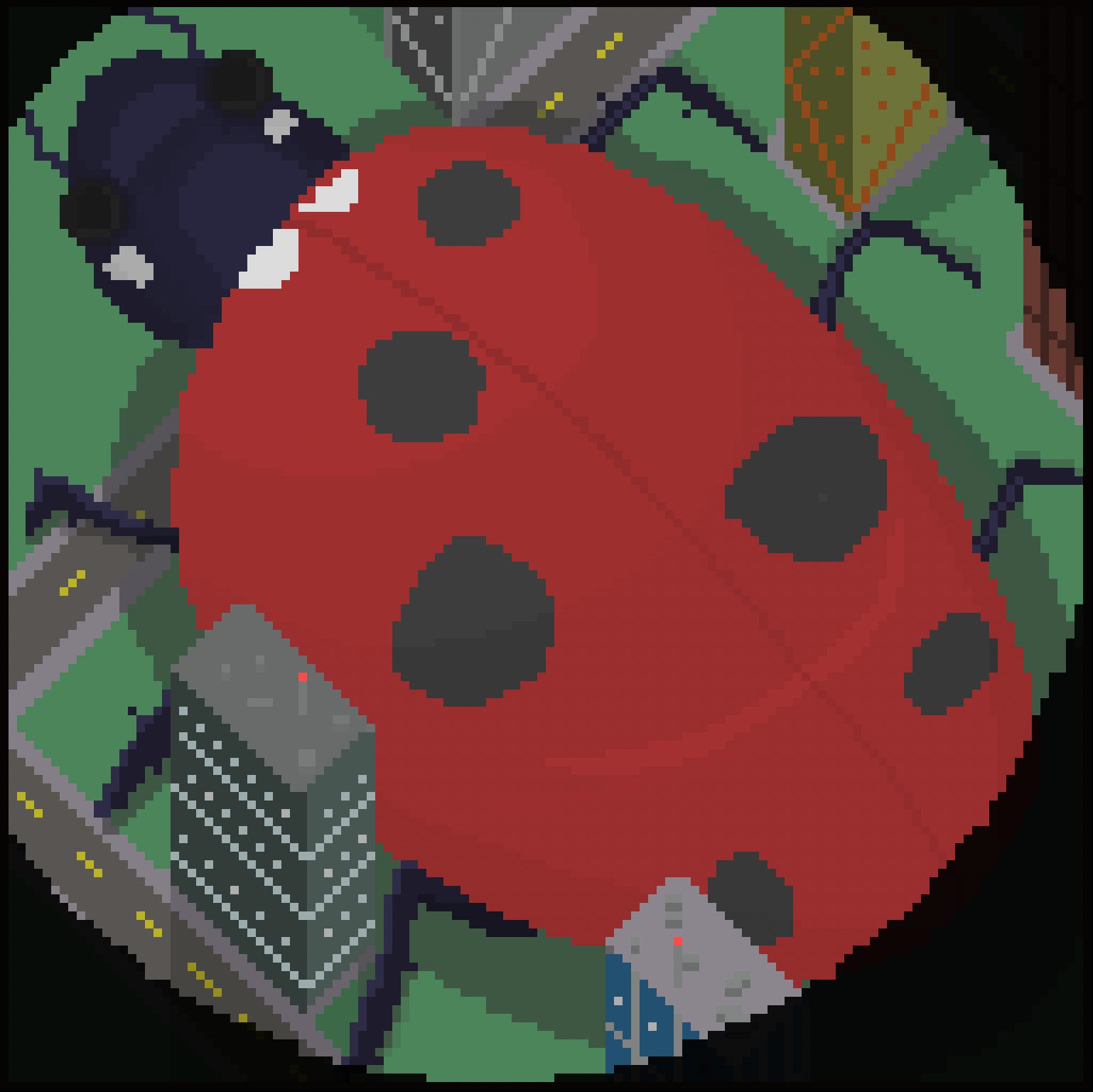
I think I’ve spent way too long looking at ladybugs.
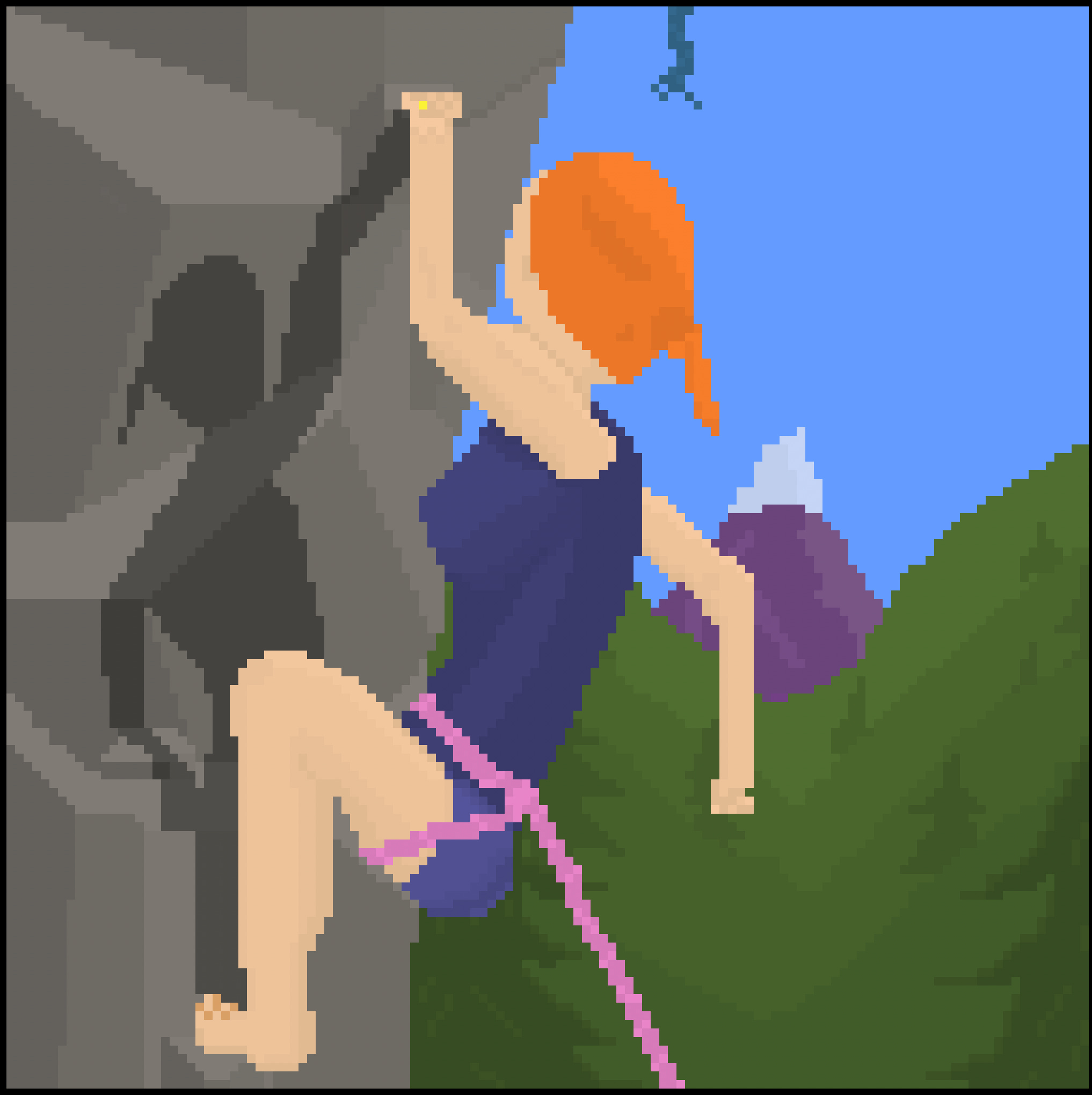
I finished the chapter on Anatomy. It’s increased my confidence to attempt human figures but it’s still hard, particularly at this resolution. Things like fingers get mushy, and I find it hard to use the details effectively.
My favorite part of this picture is actually the leg - I had drawn the shape on my first attempt and it was the first time I thought “wow, this turned out exactly how I envisioned it”.
As for the background - I used the technique from Peak to create the valley here by layering in different shades of green to simulate distance. I think it worked out.
Fun fact - this was originally a picture of a girl diving. I couldn’t get the arms for the dive right so I rotated the picture and made it about rock climbing instead.
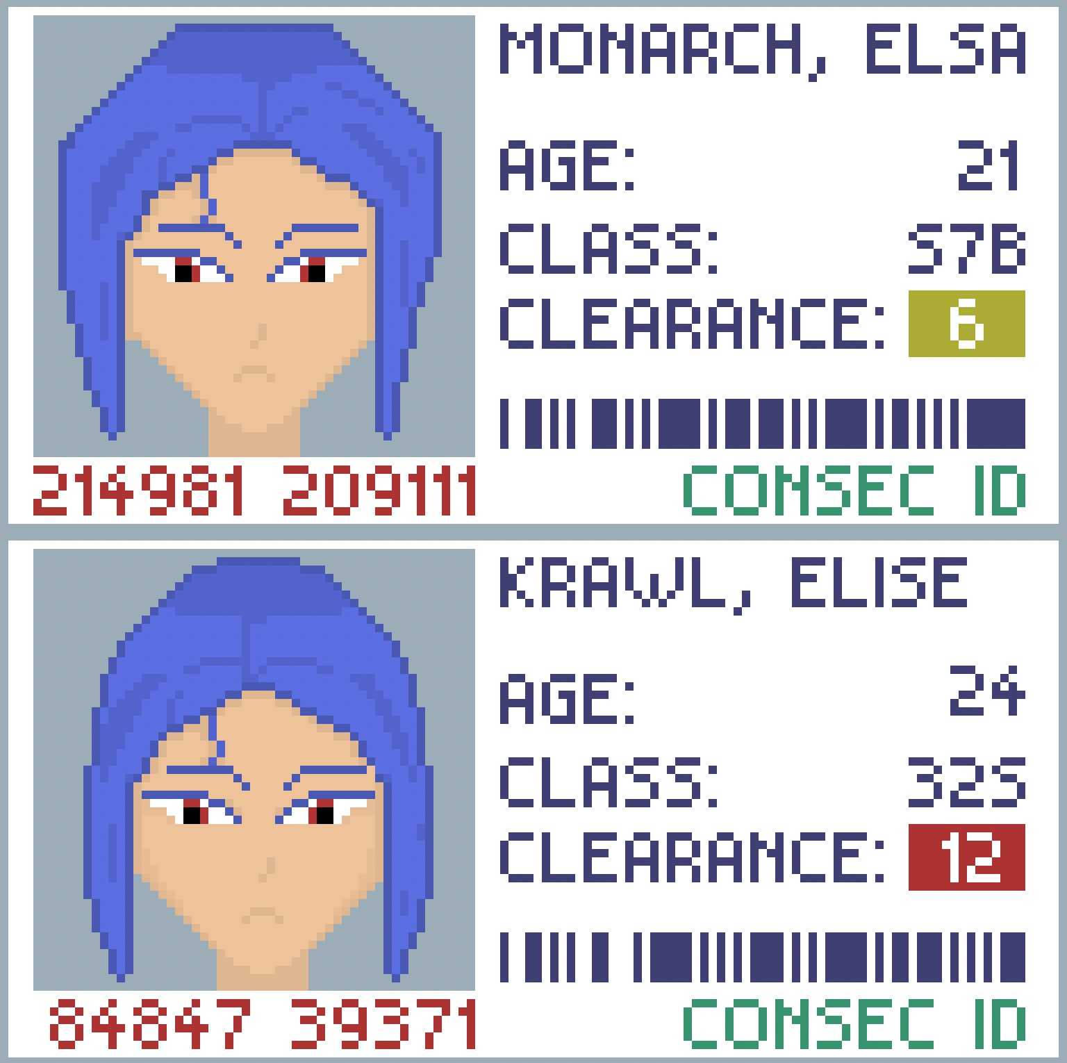
I wanted to try a hand at a more stylized face so I made a portrait of a blue-haired woman. Afterwards, I didn’t want to spend the next couple of hours drawing a body or creating a scene, so I just turned it into an identity card to suit the presentation. At work I often deal with identity verification and authentication, and this piece ended up with an accidental timely relevancy.
I had started with the eyes by creating a sheet with variations - the first few were doofy, and then droopy, and then some mix in-between. I finally got the ‘grumpy’ vibe I was going for by adding a very harsh narrow angle and leveraging the eyelashes / eyebrows.
When I moved on to the hair, my original attempt ended up very geometric, which read well but looked blocky - like a helmet instead of hair. I wanted something a touch more realistic, so I made it more naturally curved, which made it look distinct from the original.
That made it click - there’s a difference between accurate representation and character. One reads more realistic, but the other reads more memorable, and I can’t say which is better.
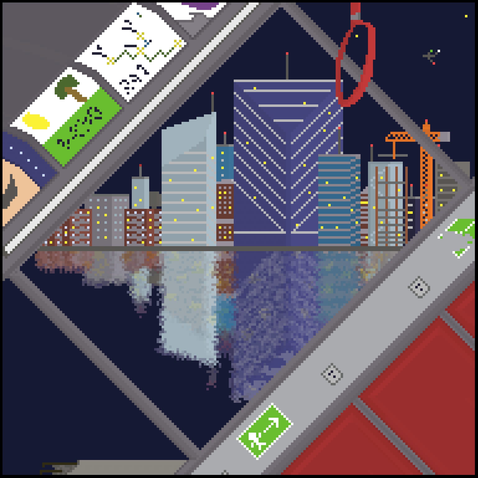
No matter how hard life gets, it’s always been oddly comforting to me to know that the rest of the world moves on unaffected. I wanted to capture that sentiment in an image.
I used a different technique for this picture - instead of starting with color blobs / shapes, I started with black and white lines. It ended up working really well in ensuring my lines were consistent and gave me small sections to fill in with details, which made going the entire 192x192 scene fairly manageable.
I really like how it turned out, though it took me a few hours.
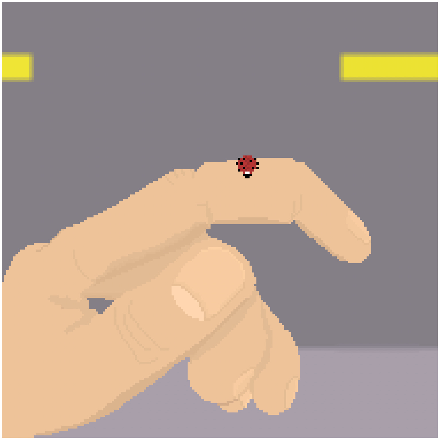
Wow, hands are hard. I knew it was going to be, but it was somehow even more challenging. There’s perspective, angles, proportion, value separation, shading, shadows, colors.
Towards the pinky it got really muddy so I had to cheat and add a dark outline. It also has some proportion issues - without çarving or shading some of the fingers read a bit too thick. I didn’t even attempt to add the surface detail like veins, wrinkles and the red tone that real fingers have.
Still - I’m pretty happy at how it came out for a first attempt at a close-up of a hand. When I first started drawing it I didn’t think I’d end up with a readable result, but it came out legible!
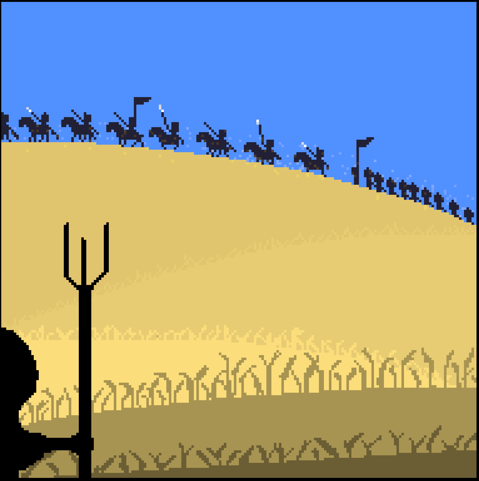
I decided to do a simpler picture after two more complicated ones. This one has the feel of my earlier 16x16 pictures, but the 192x192 resolution lets me have more silhouettes and details.
It’s funny - the more resolution I have, the more resolution I feel I need. My initial 16x16 images were symbolic representations but I thought they were pretty good. Now, at 192x192, I’m wondering to myself if I need to move to 256x256.
My gut tells me I don’t need to - yet. I think I need to work on texture and detail - using the strength of 16x16 symbolism to represent things but as part of a larger 192x192 picture - a best of both worlds kind of deal.
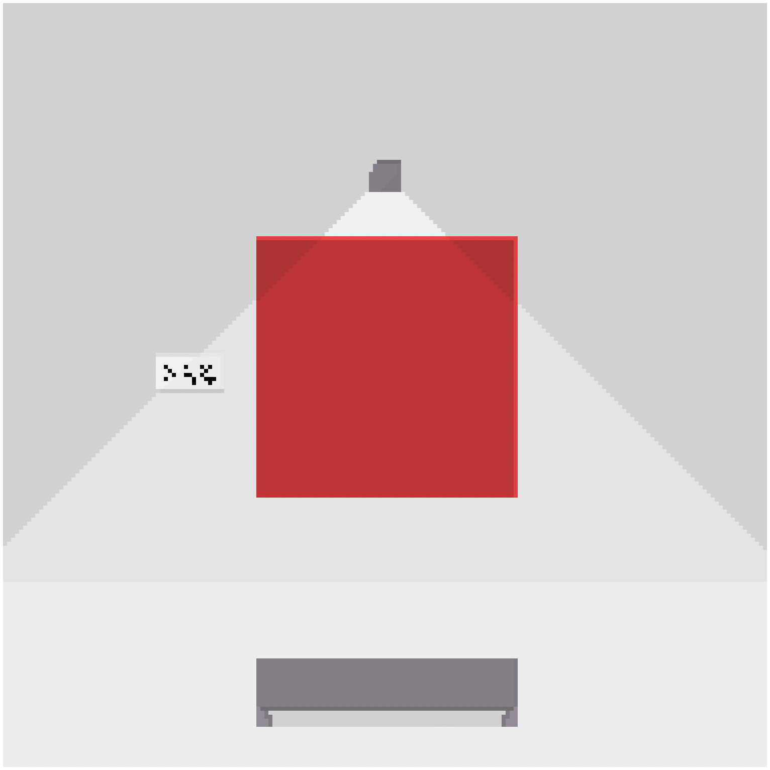
At what point is a picture done? When is it fit for consumption? For archiving? For sharing? How do you even tell?
What if I don’t actually need to draw more than a pixel?
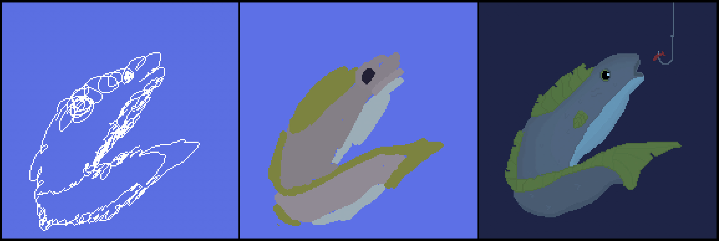
Let 10/13/2026 mark the day where I discovered the power of scribbles!
I couldn’t really think about what to draw next, so I just started scribbling and eventually a shape appeared. I blobbed it with some color and it turned into a picture!
Now that I have some techniques under my belt, I’m able to actually turn them into recognizable images!
Drawing is so fun.
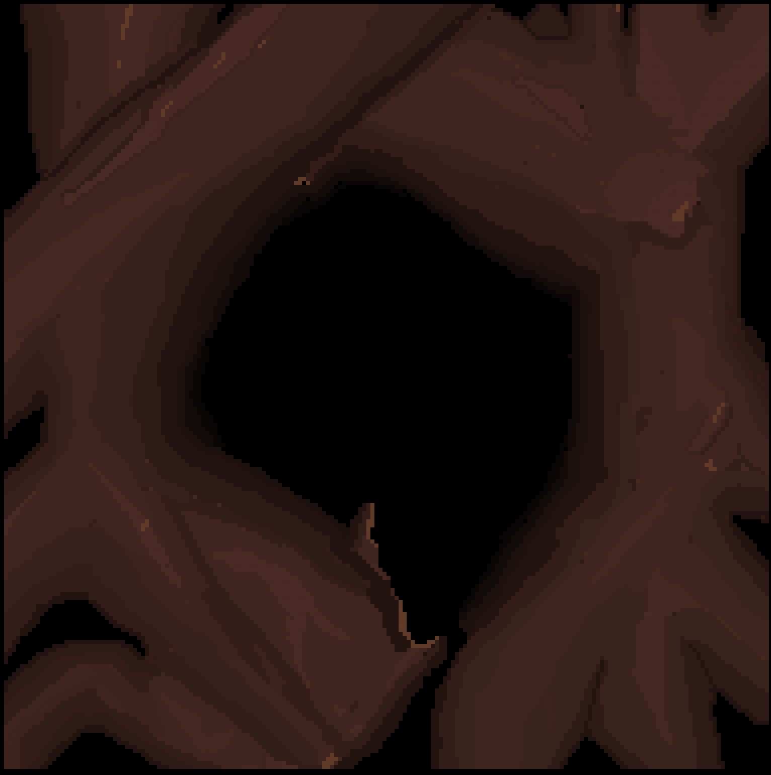
Drawing is like a bottomless pit of stuff to learn and create. There’s so many different paths and techniques and styles.
I tried the scribble technique with this one, and then thought to myself: what if I scribbled with colors? So, I did!
I really love how the wood details started to take shape and meld with each other. The more I randomly drew with the browns, the more the shape and depth and detail emerged.
The end result made it actually look a bit like wood - this may be the first picture I’ve actually had texture with.
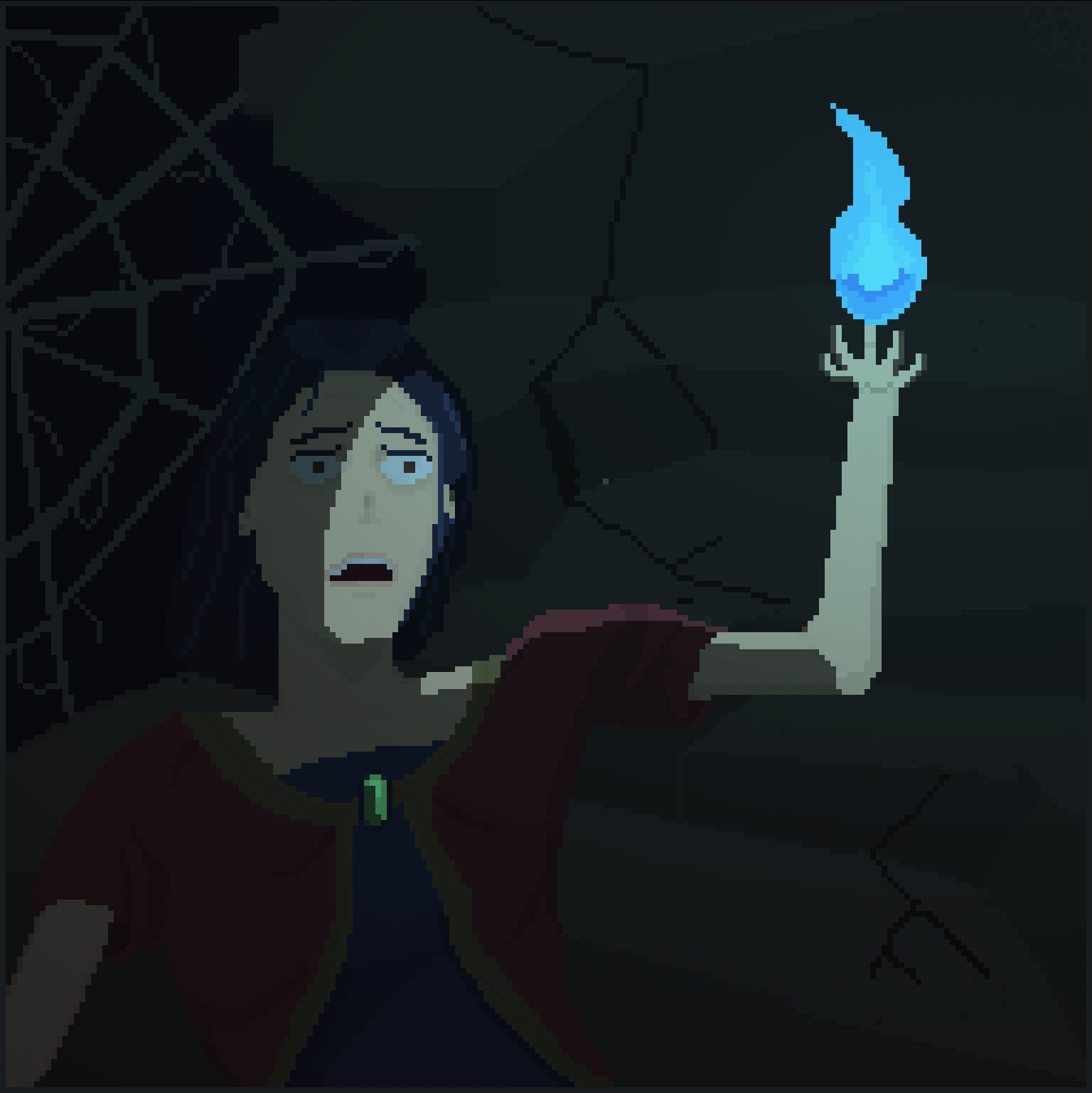
This is the first one I worked on for more than a day - I kept trying to abandon it because I couldn’t get the face how I wanted it.
I’m glad I stuck in there.
This is also the first one where I paid more attention to the lighting. It’s still not natural, but it’s much more lighting-centric than my other drawings.
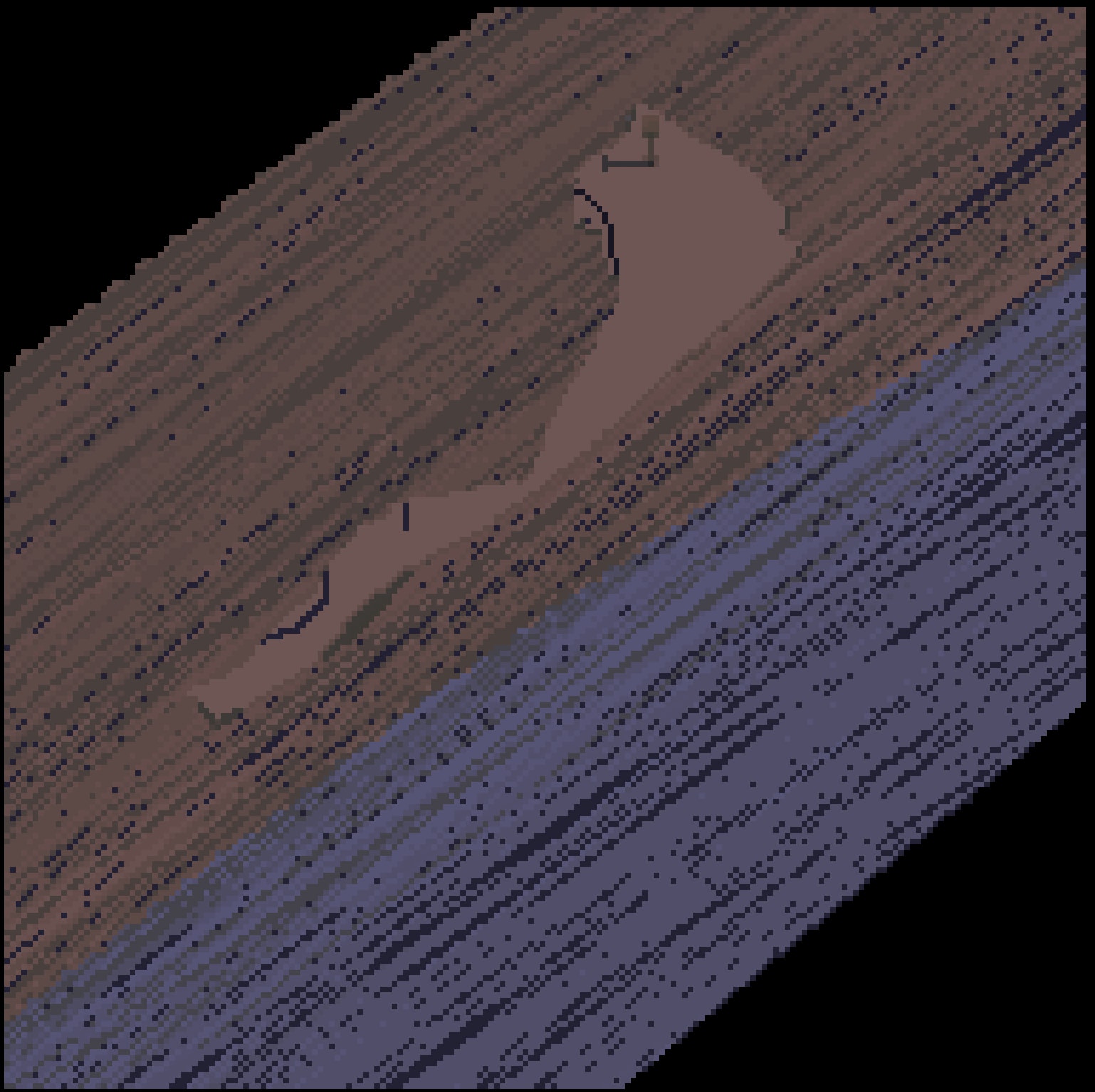
This started off as a scribble 'space’ scene with a asteroid belt, and when I tried adding lighting to it, it ended up looking like a block of wood.
I was even more surprised at how the grey I used reacted to the lighting - it felt quite harmonious.
I think the technique ended up with a stylized detail that could work well if incorporated into a larger scene.
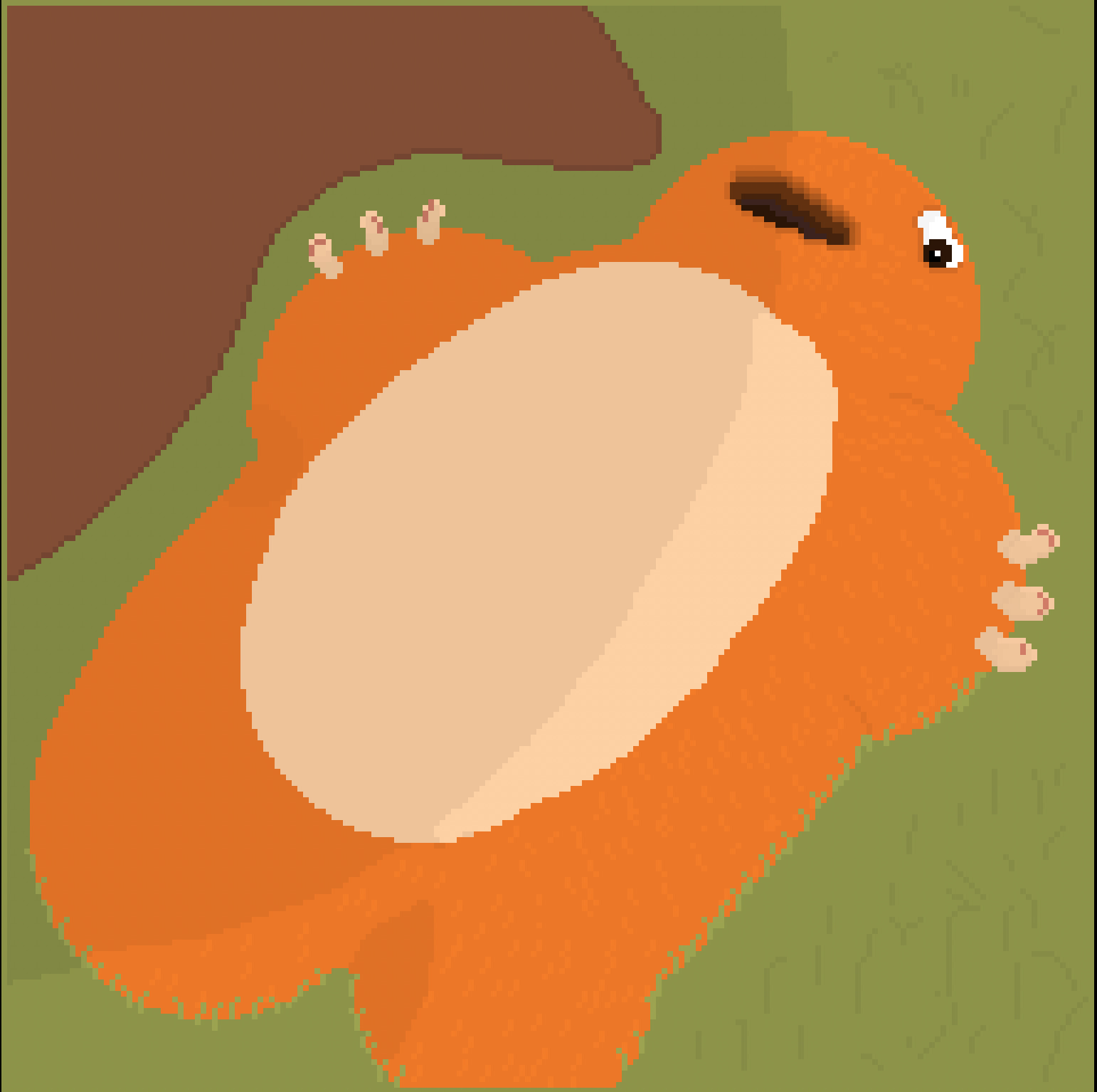
In my third exploration of texture, I tried going for a furry detail here. I think it kind of worked out - I was a bit sloppy with my placement but it definitely looks furry.
Though again, looks can be deceiving!
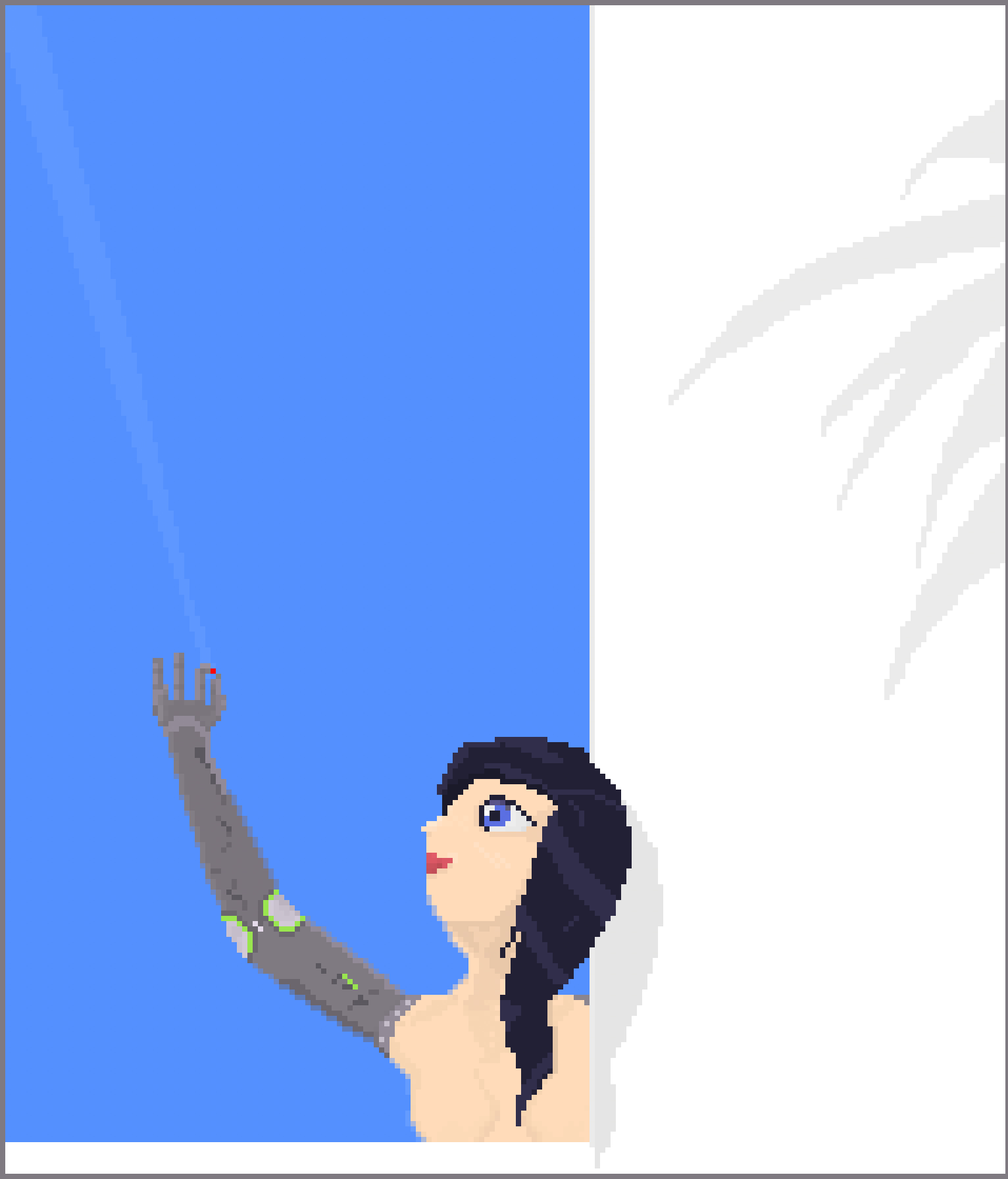
I still find it pretty difficult to draw people.
I had to change the arm to a robot arm because I couldn’t figure out how to make it seem like a human arm. I also couldn’t figure out the torso, but it kind of works out OK within the context of the picture because it’s a robot now.
The proportion and pose isn’t quite aligned - I could move the arm slightly more forward to align with the head more, and adjust the proportion of the upper arm with the lower arm and torso.
The hair didn’t quite turn out how I wanted, but at the same time - it kind of also did? I can’t quite put my finger on it. I like how the eyes and mouth and nose turned out, though.
But - these are relatively minor adjustments I’m more confident in making.
I saw a pixel art in the past with a similar head pose and thought “wow, I wish I could draw something like that” - who knew I’d kind of get there.
Looking back after 21 days
2026-10-17
I made it way further than I thought I would in just 21 days. I don’t actually plan for my side projects to be exactly 21 days - it kind of just naturally happens regularly.
My other 21-day projects like Palette, Light, etc. would eventually devolve into my losing interest, but that hasn’t happened yet with learning pixel art - my interest and excitement is still quite high.
I think I’m going to continue pursuing it even past 21 days, though perhaps in a different post or format.
My original goal
I don’t think I accomplished my original goal of making game sprites. I made one - Eyebat - but I found drawing standalone pictures a lot more fun. They tell a story and let you impart a thought or feeling, but sprites have to be incorporated into a larger piece of work to achieve the same effect.
That doesn’t mean I can’t make sprites, though - I think a lot of the things I learned are transferable to sprite-making, though I imagine there’s also nuanced challenges that come with sprites I haven’t encountered yet.
My learnings
I learned a lot and have so much more to go. Art techniques like composition, planes, perspective, colors, lighting, anatomy - it’s just the very beginning. I need to keep practicing.
I found I enjoyed drawing about and exercising certain concepts - unknown unknowns, continuity beyond what’s present, differences in scale, the power of recognition, observation, uncertainty, sufficiency, implied relationships, and control.
Unlike my day-job which is all about ensuring every risk is managed and controlled, I found art a lot more flexible: even mistakes and accidents led to very enjoyable outcomes.
Parting thoughts
This whole experience has taught me to pay more attention to the world around me. I find I’m noticing more than I did before when I was focused exclusively on a goal. The world is meant to be experienced and I’ve kind of just been missing it.