How to Design Software — Dynamic Heatmaps (Chloropeths)
Learn how to create a dynamic heatmap of the United States by yourself, without having to buy a license from a company that sells charts.


Learn how to create a dynamic heatmap of the United States by yourself, without having to buy a license from a company that sells charts.
A strangely large number of companies I’ve worked with somehow inevitably get to the point where they want to build or integrate a heatmap of some kind.
In the past, I would reach for the nearest charting library like HighCharts. Why reinvent the wheel, and besides, their charting is cool!
Over time, as I felt the itch to incorporate heatmaps into my weekend projects, I kept bumping it off due to the price. I kept asking myself “is this too expensive for a personal project?”
I don’t know about you, but for me the answer is yes. Some charting libraries charge a licensing fee of $500 per developer. This prices out almost every individual looking to use it for any “for-fun” usage. I lose far too much money buying SPY puts in the stock market to be able to afford spending $500 for a weekend project.
So, like all engineers, I spent half an hour and made it myself.
What is a heatmap?
A heatmap essentially shows a map and colors in various aspects of it based on some sort of scale.
The “map” doesn’t necessarily have to be a map — it can be a periodic table or a bunch of circles. What really matters is that there are distinct areas that will be colored differently depending on what bucket that distinct area falls in to.
As I later learned, these are common called chloropeths.
The components
There’s three aspects of a heatmap as far as web applications are concerned.
the map
the code
the data
The map
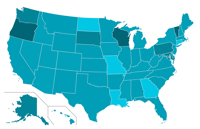
First off, you need an SVG of a map that you can color. I took this one from the Wikimedia Commons:

Breaking down an SVG
If you ever interacted with an SVG file, you may have noticed it behaves differently than other image files. Some sites don’t let you upload them, they maintain their quality when their size changes, and your browser seems to be the default file opener in a lot of cases.
Well, that’s because they are different. SVGs actually consist of markup. If you inspect an SVG file, you’ll see all of the markup that makes up the SVG image.

All of that incomprehensible garbage is actually the data that then makes up the individual lines and shapes. This means that you can do a lot of things like interact with it using Javascript and CSS. It behaves like HTML, so you can add styles, ids, attributes, etc.
That’s where the true power is.
Prepare your SVG
So, let’s assume you found or created your SVG. If you create one, I don’t recommend coding it — use a drawing tool that will output an SVG.
You need to prepare your SVG by adding identifiers to all of the various parts you want to independently color.
The map above was particularly convenient — it was already categorized into states. For others, you may need to do it yourself.
Each of the individual <path> elements that make up a state had an ID attached to it with the ISO 3166 Alpha-2 code.
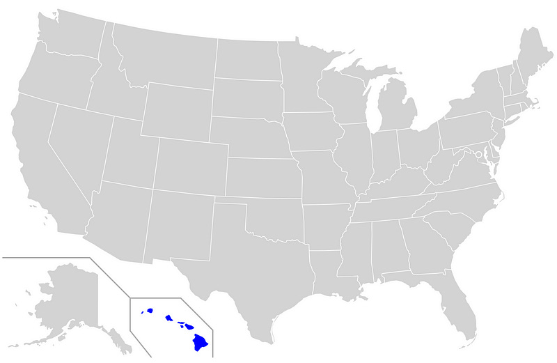
Hawaii, for example, has an id of HI. If your map is missing it, simply add the id="HI" to the <path> that makes up Hawaii.

The Code
Now, let’s write the coloring function. It’ll be a function that takes an identifier and sets a color. We’ll flesh this out later once we structure the data appropriately — for now let’s stub it out and return a randomly selected color.
We don’t care about the color specifically or how it is chosen. What we are caring about is tying it together.
// map.js
function setColorFor(state) {
  let color = Math.random() > 0.5 ? 'red' : 'blue';
let element = document.getElementById(state)
if (element) {
element.style.fill = color;
}
}setColorFor('HI');Put them both in an HTML file
Let’s go and put them together.
<!-- map.html -->
<html>
<body>
<svg xmlns="http://www.w3.org/2000/svg" viewBox="0 0 930 585">
<!-- Put the rest of the SVG here... -->
</svg> <script type="text/javascript" src="map.js"></script>
</body>
</html>You should see something like below:
The Data
Now, we get to the final piece of the puzzle: the data.
Structure of data
We need to structure the data in a way we can push it to the map while maintaining domain independence. All this means is that we shouldn’t have to change the code to make it work with another use case.
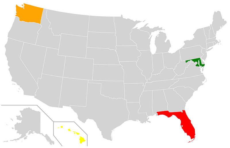
Suppose we are using this map to visualize the extent of coronavirus cases in the United States. Let’s make up some numbers and see what a subset of this data would look like:
let positiveTests = {
HI: 500,
WA: 1000,
MD: 10,
FL: 9001
}Great! We clearly have a key-value pair of state code to value. Now, how do we bucket these into groups along a scale? I’m not a data algorithm expert, so we’ll do a bit of a janky approach.
First calculate how we want to distribute it
The first decision to make — how many buckets do we want?
Let’s suppose we want to have the following breakdown:
High (≥ 5000) [Red]
Moderate (≥ 1000 and < 5000) [Orange]
Low (≥ 500 and < 1000) [Yellow]
Minimal (< 500) [Green]
Unknown [Grey]
We effectively have 5 buckets that we will divide the values into. This is what I will call the distribution scale (not the actual name since I’m not a data guy).
This distribution scale can be hard-coded as below:
function getColorFor(value) {
if (!value) {
return 'grey';
}
else if (value >= 5000) {
return 'red';
}
else if (value >= 1000) {
return 'orange';
}
else if (value >= 500) {
return 'yellow'
}
else {
return 'green';
}
}Now, let’s incorporate this getColorFor(value) function into the setColorFor(state) function we created above in our map.js script:
// map.js
let data = {
HI: 500,
WA: 1000,
MD: 10,
FL: 9001
}function setColorFor(state) {
let color = getColorFor(data[state]);
  let element = document.getElementById(state)
  if (element) {
    element.style.fill = color;
  }
}function getColorFor(value) {
// ...
}setColorFor('HI');At this point, Hawaii should turn yellow — this makes sense because our data says that Hawaii has ≥ 500 cases. However, all the other states in the dataset are still grey.
Coloring the other states
The other states are still grey because the coloring of states is hard-coded.
The setColorFor('HI') line is the line of code that is triggering the color change. We could go and write out every single state, but that is boring and just poor engineering.
Let’s go and make it so that we don’t have to list every state individually. Let’s remove setColorFor('HI') and replace it with the below code.
//map.js
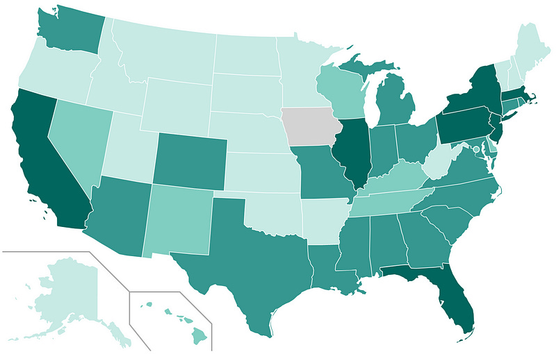
// ...all other codefunction applyData(data) {
Object.keys(data).forEach(function(key) {
setColorFor(key);
});
}applyData(data);Now we should see all the states we included in our dataset light up like a rainbow:
You can now see how you would start adding new colors, etc. It’s all very straightforward to do.
Addressing other concerns
There’s some other areas of concern you may encounter while attempting to do this in a production environment.
Making it work with frameworks like Vue.js, React, or Angular
I used vanilla JS and HTML in the examples to simply illustrate the concepts, but many modern web applications are written using actual frameworks and libraries.
An application of the approach in a production environment would likely involve many other aspects such as componentization, theming, etc. and leverage actual frameworks or libraries.
The great news is that you can easily follow the same exact technique and accomplish the goal regardless of the front-end technology. Vue, for example, allows you to use directive bindings directly on the SVG <path> elements.
Linked below is a Github repository I created illustrating the full approach describe above in vanilla Javascript, with an included sample of what it would look like as a Vue.js component:
JGefroh/example-heatmap
This repository illustrates an example of how to create your own heatmap. Read my accompanying blog post for a…github.com
Automatically scaling the heatmap
You may notice that, when resizing the browser window, your map doesn’t automatically adjust in size. You’ll need to do some extra configuration to make this work.
For the map above, adding a viewbox attribute with a value of 0 0 930 585 to the SVG element made it scale appropriately for me (designers may shriek in terror at the eyeballing I did). Different contexts and SVGs will require different scaling approaches.
If you want to learn all of the in-and-outs of SVG resizing and scaling, Amelia Bellamy-Royds wrote a fantastic article about in on CSS-Tricks:
How to Scale SVG | CSS-Tricks
The following is a guest post by Amelia Bellamy-Royds. Amelia has lots of experience with SVG, as the co-author of SVG…css-tricks.com
Creating a linear distribution
Perhaps you don’t want to pre-define the buckets, but rather divide the groups into a known number based on an interval that is dependent on the data.
You can do this by finding the maximum value in the dataset and then dividing it by the number of bucket you would like to have. This will give you the interval, which you could then color the sections by:
function getInterval(numbers) {
  const NUMBER_OF_BUCKETS = 3;
let maximum = Math.max.apply(Math, numbers); return maximum / NUMBER_OF_BUCKETS;
}function getStyleFor(stateCode, valuesByStateCode) {
let interval = getInterval(Object.values(valuesByStateCode));
let value = valuesByStateCode[stateCode] if (value <= interval) {
return 'fill: #01C7E5';
}
else if (value <= interval * 1) {
return 'fill: #03C2DF'
}
else if { // ...and so on
}}Dynamic color and data scales
You can dynamically set the color or data scale by accepting an ordered array of colors, or a function that determines it.
If you truly wanted, you could make it fully data-driven. Something like below can be done:
let valuesByStateCode = {
  HI: 30,
  WA: 50,
  FL: 2
};
let buckets = [
{ color: 'green' },
{ color: 'blue' },
{ color: 'red' },
];function getInterval(numbers) {
let maximum = Math.max.apply(Math, numbers);
return maximum / buckets.length;
}function getStyleFor(stateCode) {
let interval = getInterval(Object.values(valuesByStateCode));
let value = valuesByStateCode[stateCode] let bucketIndex = Math.floor(value / interval);
let bucket = null; if (isNaN(value)) {
bucket = buckets[0];
}
else if (bucketIndex >= buckets.length) {
bucket = buckets[buckets.length - 1];
}
else {
bucket = buckets[bucketIndex]
} return `fill: ${bucket.color}`;
}This code accepts an ordered array of colors and automatically figures out the number of buckets to divide the values into. Once that is done, it buckets the values received into those colors automatically.
You could then code further and create a gradient off a base color instead of having a pre-defined color scale if you wanted to, but I leave that as an exercise to the reader.
And that’s about it!
That’s the basics of creating a heatmap. Turns out you can do it in about half an hour and save yourself or your company thousands of dollars if cost is a concern and all you need are some basics.
Note that you aren’t limited to maps of the United States. The technique illustrated above will work for pretty much any heatmap-style coloring. As long as you have a properly constructed SVG, you’re good to go.
Did you like this article? Let me know in the comments, or connect with me on LinkedIn!